
How to Make a Weakness Potion: Step-by-Step Guide
How to Make a Weakness Potion: Step-by-Step Guide
Whether you’re deep into a fantasy RPG campaign, creating props for a themed event, or just exploring the creative world of potion-making as a hobby, crafting a weakness potion can be an unexpectedly fun and rewarding project. While we’re not dealing with actual magical ingredients here, the process of blending colors, textures, and theatrical elements to create a convincing potion bottle is genuinely engaging. This guide walks you through creating a visually stunning weakness potion that looks authentic enough to convince anyone at your next game night or costume party.
The beauty of potion-making lies in the flexibility of the craft. You can go as simple or as elaborate as your vision demands. Some people prefer a minimalist approach with just colored liquid and a label, while others dive into the deep end with layered effects, glowing elements, and intricate bottle designs. Whatever your skill level or budget, there’s a version of this project that works for you.
Let’s explore how to transform everyday materials into something that genuinely looks like it belongs in a fantasy world.
Understanding Potion Aesthetics
Before you start mixing liquids and adding colorants, take a moment to think about what weakness actually looks like visually. In most fantasy media, weakness potions tend to have specific visual characteristics: they’re often murky or cloudy, sometimes with a sickly green or pale yellow hue, and they might have particles or sediment floating throughout. The aesthetic should feel slightly ominous or unsettling—this is a potion that weakens, after all.
The key to making your potion believable is understanding that fantasy isn’t about perfection; it’s about atmosphere. A weakness potion should look like something you wouldn’t want to drink, even if you didn’t know what it did. Think about incorporating elements that suggest degradation or instability. Slight discoloration, cloudiness, or unusual texture all contribute to the overall effect.
Consider your intended use too. If this potion is going into a tabletop RPG display, it needs to look good from a distance and up close. If it’s for a video or photograph, lighting becomes crucial. If it’s for cosplay or a costume event, durability matters more than perfect aesthetics.
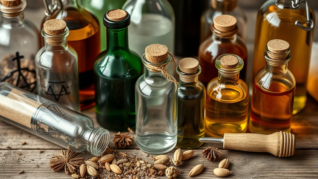
Gathering Your Materials
The foundation of any good potion starts with having the right supplies on hand. You don’t need anything exotic or expensive—most of what you’ll use probably already exists in your home or can be picked up at a local craft store for minimal cost.
Essential Materials:
- Glass or plastic bottle (any size works, but 2-4 oz bottles photograph well)
- Water or clear liquid base
- Food coloring or liquid dyes
- Glitter, mica powder, or other visual effects
- Labels and adhesive
- Mixing containers
- Spoons or stirring implements
- Funnels for easy pouring
Optional Enhancement Materials:
- Glow-in-the-dark paint or powder
- Biodegradable glitter for eco-conscious crafters
- Dried herbs or flowers for authenticity
- Cork or decorative stopper
- Wax sealing kit for vintage aesthetics
- Essential oils for subtle scent (optional)
The quality of your bottle matters more than you might think. Clear glass bottles show off your work best, but plastic bottles work fine if you’re concerned about breakage. Amber or colored glass adds instant authenticity if you can source it. Visit craft stores, thrift shops, or check your recycling bin—old spice jars, potion-shaped bottles, and vintage glass containers all work beautifully.
Choosing Your Base Liquid
Your base liquid is the foundation of everything that follows. While water works perfectly fine, there are several options that create different effects and aesthetics.
Water-Based Options:
Plain water is your simplest choice and works wonderfully when paired with food coloring and glitter. For something slightly more sophisticated, consider how to make distilled water at home—it’s clearer than tap water and looks more polished in the final product. Distilled water also won’t cloud as quickly over time, making it ideal if your potion needs to last beyond a single event.
Other liquid options include clear corn syrup (which creates a thicker, more viscous potion), vegetable oil (for a completely different visual effect), or even clear gelatin for a semi-solid consistency. Each creates a different aesthetic and behaves differently when you add colorants and effects.
Practical Considerations:
If your potion needs to remain stable for extended periods—say, several months on a shelf—avoid anything organic that might ferment or grow mold. Water with a tiny drop of bleach works, though this isn’t ideal if children might access it. For display purposes, mineral oil mixed with water creates an interesting separated effect that looks genuinely otherworldly.
The viscosity of your base liquid affects how glitter and particles move through it. Thicker liquids like corn syrup keep glitter suspended beautifully, while water lets particles settle more quickly, which can actually look more realistic depending on your vision.
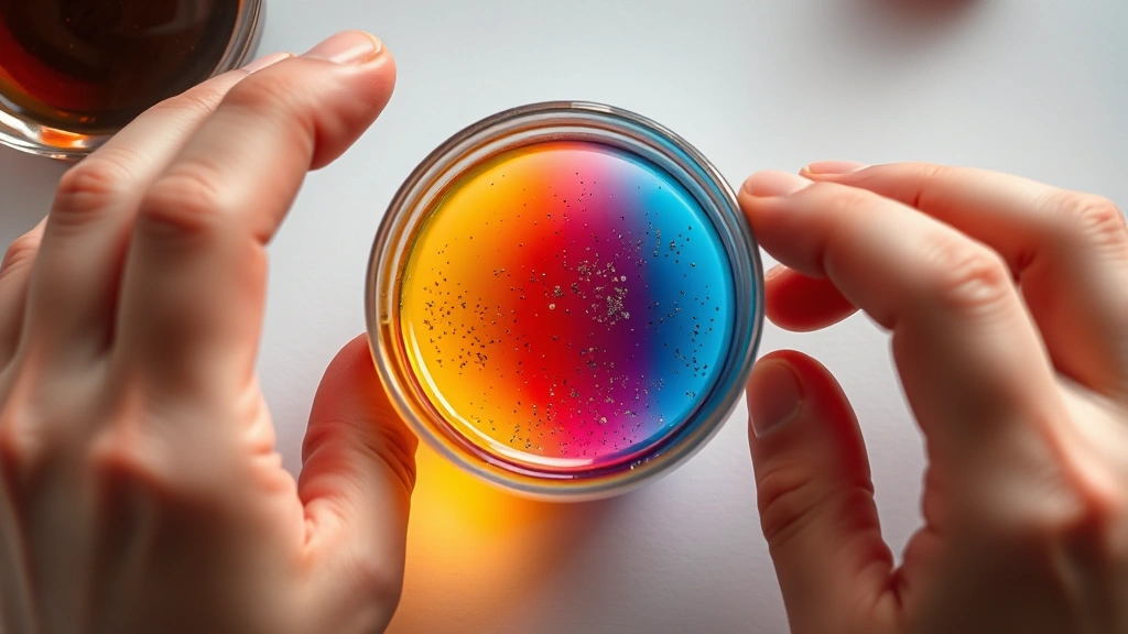
Creating the Perfect Color
Color is where your weakness potion really comes to life. The traditional weakness potion aesthetic leans toward sickly greens, pale yellows, murky browns, or washed-out purples. These colors suggest something unpleasant or corrupted.
Achieving Weakness Aesthetics:
Start with food coloring as your primary colorant. Green is the obvious choice, but don’t just grab the bright neon green from the bottle. Instead, mix green with small amounts of black or brown to create something murkier and less appetizing. A single drop of black food coloring can completely transform bright green into something that looks genuinely unpleasant.
For a sickly yellow approach, mix yellow coloring with just a touch of green to create that nauseating pale-yellow-green that suggests illness or decay. This combination works particularly well if you’re aiming for a potion that debilitates through sickness rather than direct physical weakness.
Purple weakness potions create a different vibe—more mystical and arcane. Mix blue and red to create a murky purple, then add black gradually until you achieve a color that feels slightly wrong, like something that shouldn’t exist in nature.
The Cloudiness Factor:
Professional-looking weakness potions usually aren’t perfectly transparent. They have a slight cloudiness or haziness that suggests the ingredients haven’t fully dissolved or that something unstable is happening at a molecular level. You can achieve this by adding a tiny amount of white paint or milk to your colored liquid, or by using mica powder which creates a naturally cloudy effect while adding shimmer.
Mix your coloring gradually and test in a clear container before committing to your final bottle. Food coloring is forgiving—you can always add more, but removing excess color requires starting over.
Layering and Effects
This is where potion-making becomes genuinely artistic. Layering different liquids, adding particles, and incorporating visual effects transform a simple colored liquid into something that looks genuinely magical.
Creating Layers:
If you’re using liquids of different densities, you can create natural layers without them mixing. Oil floats on water, corn syrup sinks below water, and honey creates its own distinct layer. Start with your densest liquid on the bottom and carefully pour lighter liquids on top. This creates a visual effect that suggests complexity and instability—perfect for a weakness potion.
To pour without mixing, use a spoon or pour very slowly down the side of the tilted bottle. Some crafters use a thin tube or pipette for precise control. The slight mixing that occurs at layer boundaries actually adds to the effect, creating gradient zones that look more authentic than perfectly distinct layers.
Adding Particles and Effects:
Glitter is your friend here. Biodegradable glitter looks more sophisticated and environmentally conscious, but regular craft glitter works fine. Mix glitter directly into your liquid, or layer it between different colored sections. The way glitter catches light adds dimension and movement to your potion.
Mica powder creates a shimmering, cloudy effect that looks otherworldly. Mix it into your base liquid gradually—a little goes a long way. Dried herbs, flower petals, or even small pieces of paper can float in your potion to suggest ingredients or decay.
For a more unsettling effect, consider adding a small amount of fake blood (corn syrup and food coloring) that sinks or floats depending on your base liquid. Just a hint of red or dark purple swirling through your weakness potion creates an ominous appearance.
Bottling and Presentation
The bottle you choose matters almost as much as what’s inside it. Your presentation choices communicate instantly whether this is a serious prop, a fun craft project, or something meant to be humorous.
Bottle Selection:
Small glass vials or apothecary bottles work beautifully for authentic fantasy aesthetics. These communicate “serious potion” immediately. Vintage medicine bottles add historical weight to your creation. For something more whimsical, unusual shapes—teardrop bottles, skull-shaped containers, or bottles with interesting stoppers—make your potion memorable.
If you’re using a plastic bottle, consider wrapping the lower portion with leather cord or fabric to make it look more intentional and less like you grabbed a random container. This simple touch elevates the entire presentation.
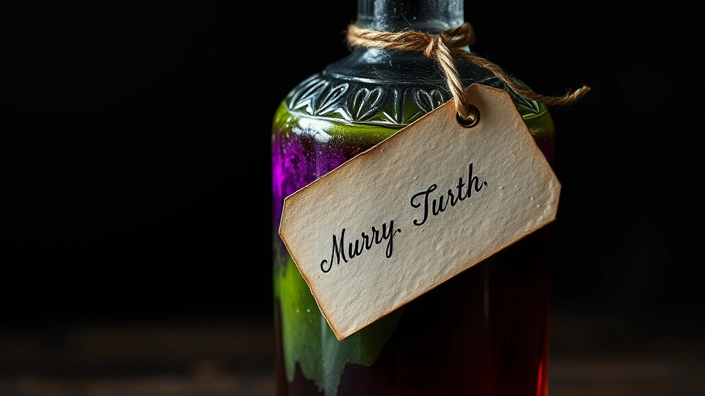
Labels and Identification:
A well-designed label transforms your potion from interesting craft project to believable fantasy item. Handwritten labels on aged paper look more authentic than printed ones, though printed labels can work if designed carefully. Include the potion name (“Weakness Elixir,” “Debilitating Draught,” etc.), possibly ingredients, and any warnings or instructions.
Experiment with different label styles: medieval script, alchemical symbols, cryptic abbreviations, or straightforward apothecary labeling. The style should match your bottle’s aesthetic and the overall tone of your project.
Sealing and Closure:
The stopper or closure you choose affects both function and aesthetics. Cork stoppers feel authentic and work well with aged glass bottles. Wax seals over cork add an extra layer of fantasy authenticity—you can find wax sealing kits online or at craft stores. For a more casual approach, a simple plastic cap works fine but can be dressed up with decorative tape or cord.
Advanced Techniques
Once you’ve mastered the basics, several advanced techniques can elevate your weakness potion to impressive levels.
Glow-in-the-Dark Effects:
Adding glow-in-the-dark powder or paint creates a stunning effect, especially in low-light environments. Mix glow powder directly into your base liquid, or paint it inside the bottle before filling. The eerie green or blue glow suggests magical energy and makes your potion unmistakably supernatural. This technique works particularly well for weakness potions meant to look corrupted or unstable.
Settling and Movement Effects:
Create a potion that visually changes over time by using liquids that interact slowly. Oil and water create interesting separation effects. Glitter that slowly settles suggests the potion is becoming more stable (or less stable, depending on your narrative). Some crafters use clear gelatin mixed with liquid to create a semi-solid that moves sluggishly, creating an unsettling effect.
Scent Integration:
While optional, adding scent creates a multisensory experience. A single drop of essential oil—something like pine, eucalyptus, or even unpleasant scents like anise—can enhance the potion’s authenticity. This works best for potions you’ll be showing off in person rather than photographing. Be cautious with scents; you want something subtle that enhances rather than overwhelms.
Temperature-Responsive Elements:
Certain paints and pigments change color with temperature shifts. While not necessary, these create a genuinely magical effect when someone handles your potion bottle. The color shifts suggest the potion is responding to external stimuli, adding an interactive element to your creation.
Preservation Techniques:
If you want your weakness potion to last for months or years, proper preservation matters. Food coloring and water-based solutions can develop mold or algae over time. Adding a tiny amount of rubbing alcohol acts as a preservative without significantly changing the appearance. Alternatively, switch to mineral oil or use a clear resin to seal your potion permanently—though this prevents future modifications.
For long-term storage, keep your potion away from direct sunlight, which can fade colors and degrade materials. Cool, dark storage extends the life of your creation significantly. If you’re displaying it, consider UV-protective glass or a display case to preserve it.
Frequently Asked Questions
How long does a homemade weakness potion last?
Water-based potions typically last several weeks to a few months before developing mold or algae, especially if exposed to light or temperature fluctuations. To extend longevity, store in a cool, dark place and consider adding a preservative like rubbing alcohol. Oil-based potions last much longer—sometimes years—without degradation. For permanent display pieces, consider using clear resin or sealing the bottle completely.
Can I make a weakness potion that’s actually drinkable?
While you could technically create a safe, drinkable potion using food coloring and edible glitter in water, this isn’t recommended for display or game pieces. It’s too tempting to accidentally consume, and even food-safe ingredients aren’t meant to be ingested in the concentrations you’d use for visual effect. Keep your potions as display pieces only.
What’s the best bottle size for a weakness potion?
For display and photography, 2-4 ounce bottles work beautifully—they’re large enough to show detail but small enough to hold in your hand. Larger bottles (8-16 oz) work well for shelf displays. Tiny vials (under 1 oz) create an impression of concentrated power but offer less room for layering effects. Choose based on your intended use and display space.
How do I make my potion look more realistic?
The key to realism is avoiding perfection. Add slight cloudiness, use muted colors rather than bright neons, incorporate particles that settle naturally, and choose bottles that look aged or worn. Imperfections—slight color variations, uneven glitter distribution, or minor settling—actually enhance authenticity. Avoid overly shiny or pristine appearances; weakness potions should look slightly concerning.
Can I use materials from around my house?
Absolutely. Water, food coloring, glitter, dried herbs, and various household items create effective potions. Old spice jars, mason jars, or any glass bottle work perfectly. The beauty of potion-making is that it’s accessible and forgiving—you don’t need specialty supplies to create something impressive.
What if I want to make multiple weakness potions for a group?
Batch-making is entirely feasible. Prepare your base liquid in larger quantities, then divide into individual bottles. This is actually more efficient than making each potion separately. You can create slight variations by adjusting color intensity or glitter amounts in different batches, making each feel unique while maintaining consistency in quality.
Are there alternatives to food coloring?
Yes. Liquid watercolors, acrylic paint (use sparingly), ink, or even natural dyes from vegetables and plants work. Each creates different effects—watercolors tend toward transparency while acrylics create more opacity. Natural dyes like beet juice (red/purple) or turmeric (yellow) create interesting effects and feel more authentic, though they may not last as long as synthetic colorants. Test any alternative in a small amount first.
How do I photograph my weakness potion effectively?
Lighting is crucial. Backlighting shows off the translucency and glitter beautifully, while side lighting creates shadows that add dimension. For glow-in-the-dark potions, photograph in dim lighting to capture the effect. Use a simple background that contrasts with your potion’s color. Close-up shots emphasize detail, while wider shots show the overall presentation including the bottle and label. Experiment with different angles and lighting setups to find what works best.
Related Posts

How Long to Boil Lobster Tails: Cooking Guide

How Long to Fly from New York to London? Travel Times
