
Make Pink Paint? Expert Mixing Tips Inside
How to Make Pink Paint: Expert Mixing Tips for Perfect Shades
Creating the perfect pink paint color doesn’t require a trip to the store or expensive custom mixing services. Whether you’re tackling a bedroom refresh, painting furniture, or working on a creative art project, understanding the fundamentals of color mixing empowers you to achieve exactly the shade you envision. Pink is essentially a tint—red lightened with white—but the journey from basic red to your ideal pink involves precision, patience, and knowing the right techniques.
This comprehensive guide walks you through every step of mixing pink paint, from selecting your base colors to troubleshooting common mistakes. You’ll learn professional-grade strategies that painters and artists use daily, plus practical tips for matching existing colors and scaling your batches. By the end, you’ll confidently create custom pink hues for any project.
Understanding Color Theory Basics
Before mixing your first batch of pink paint, grasp the foundational color theory that makes this process work. Pink exists on the color spectrum as a tint of red—technically, it’s red with white added to reduce saturation and increase lightness. This simple formula becomes more nuanced when you consider undertones, saturation levels, and how different red bases produce dramatically different pink results.
The primary color red serves as your starting point, but not all reds are created equal. Reds vary significantly in their undertones: some lean toward blue (cool reds), while others shift toward yellow (warm reds). A cool red mixed with white produces a different pink than a warm red, even if you use identical white-to-red ratios. Understanding this distinction helps you intentionally create warm blush pinks, cool magentas, or peachy pinks depending on your project needs.
White paint acts as your modifier, diluting red’s intensity while increasing coverage and creating lighter values. However, the quality and undertone of your white matter too. Some whites carry subtle warm or cool casts that influence your final pink. Premium paint brands often specify whether their whites are warm, cool, or neutral—information worth noting before you begin mixing.
Essential Supplies and Tools
Successful paint mixing requires more than just red and white paint. Gather these essential supplies before starting your project:
- Base paints: Quality red and white paint in your chosen finish (matte, satin, or gloss)
- Mixing containers: Glass jars, plastic buckets, or dedicated paint mixing vessels with lids for storage
- Stirring implements: Paint sticks, wooden spoons, or drill-mounted mixing paddles for thorough blending
- Measuring tools: Syringes, graduated containers, or paint measuring cups for precise ratios
- Protective equipment: Gloves, aprons, and newspaper or drop cloths
- Test materials: Cardboard, poster board, or paint sample cards for color testing
- Documentation supplies: Notebook and pen to record successful ratios
Investing in quality mixing containers with tight-sealing lids proves invaluable, especially if you’re creating multiple batches or need to store mixed paint between sessions. Glass containers prevent staining and allow you to see your color clearly without the opacity that plastic sometimes introduces.
Step-by-Step Mixing Process
Follow this methodical approach to mix pink paint consistently and achieve professional results. The process requires patience—rushing leads to uneven color distribution and frustration.
Step 1: Prepare Your Workspace
Lay down protective coverings and gather all supplies within arm’s reach. Organize your red and white paints, mixing container, stirring implement, and measuring tools. Adequate lighting is crucial; natural daylight or full-spectrum LED lighting reveals true colors far better than incandescent bulbs, which cast warm yellow tones that deceive your eye.
Step 2: Pour Base Red Paint
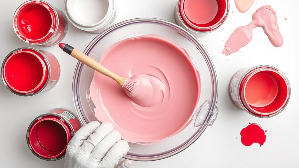
Pour your chosen red paint into the mixing container first. Start with a measured amount—typically one cup for small projects, more for larger applications. Pouring red first allows you to add white incrementally, giving you control over the final shade. Reverse pouring (white first) makes it harder to achieve lighter pinks without using excessive white, which can affect paint consistency and coverage.
Step 3: Add White Paint Incrementally
This step separates amateur from professional results. Rather than dumping white paint into red, add it in small measured increments—typically one tablespoon at a time for standard batches. Stir thoroughly after each addition, ensuring complete color distribution before assessing the shade. This patient approach prevents overshooting your target pink and wasting paint.
Step 4: Stir Thoroughly and Repeatedly
Paint mixing isn’t a quick five-second swirl. Use your stirring implement to scrape the container’s bottom and sides, incorporating all paint layers. Continue stirring for at least two minutes per addition, breaking up any color streaks or white swirls. For large batches, a drill-mounted mixing paddle saves time and ensures uniform distribution.
Step 5: Assess Color Accurately
After each white addition, place a small sample on white paper or cardboard under good lighting. The container’s color often appears darker and more saturated than the actual painted result. Allow samples to dry slightly—wet paint looks darker than dried paint—before making final shade judgments. This simple step prevents costly mistakes.
Pink Shade Variations
The beauty of mixing your own paint lies in creating precisely the pink you envision. Understanding how to achieve different pink categories expands your creative options dramatically.
Pale or Baby Pink
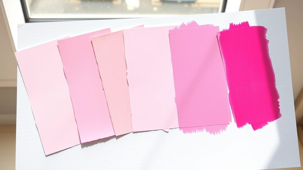
These delicate, almost pastel pinks require substantially more white than red—typically ratios of 10:1 or even 15:1 (white to red). Baby pinks work beautifully in nurseries, bedrooms, and spaces where you want softness and calm. Start with small red amounts and add white until you achieve the desired lightness. These shades photograph differently in various lighting, so test extensively in your actual room.
Blush or Dusty Pink
Blush pinks hit a sweet spot between pale and saturated, offering sophistication without sweetness. Typical ratios range from 6:1 to 8:1 (white to red). These versatile shades complement numerous design styles and work equally well in living spaces, bathrooms, and entryways. Dusty pinks often incorporate subtle gray undertones—achieve this by adding a tiny amount of black or gray paint to your basic pink mixture.
Hot or Bright Pink
These vibrant, saturated pinks contain less white relative to red—approximately 3:1 or 4:1 ratios. Hot pinks make bold statements and energize spaces. Consider using these as accent walls or in creative projects rather than full-room applications, as the intensity can overwhelm. These shades work particularly well in children’s rooms, craft spaces, or modern design schemes.
Coral or Peachy Pink
These warm pinks lean toward orange and yellow undertones. Create them by adding a small amount of yellow or orange paint to your red before introducing white. Start conservatively—a teaspoon of warm color per cup of red—then adjust based on results. Coral pinks create warm, inviting atmospheres and complement warm wood tones and earth-toned decor.
Mauve or Cool Pink
These sophisticated pinks shift toward purple and blue undertones, creating cooler, more muted effects. Achieve mauve by adding a tiny amount of blue or purple paint to your red base before white. These shades feel elegant and contemporary, working beautifully in bedrooms, bathrooms, and modern interiors.
Matching Existing Colors
Sometimes you need to replicate an existing pink—a paint chip, fabric swatch, or color from another room. This matching process requires a systematic approach and honest color assessment.
Gather Your Reference Materials
Collect paint chips, fabric swatches, or photographs of your target color in natural lighting. Avoid relying solely on photographs, as camera settings and screen displays distort true colors. If possible, obtain an actual physical sample—paint stores often provide free sample pots that you can test on your wall.
Analyze the Target Color
Study your reference material in various lighting conditions. Ask yourself: Is it warm or cool? How saturated is it? Does it lean toward coral, mauve, or true pink? What percentage appears to be white versus red? These observations guide your mixing ratios and help you anticipate undertone adjustments.
Create Test Batches
Mix small quantities based on your analysis, starting slightly lighter or less saturated than your target. Paint samples on white cardstock and place them directly next to your reference material under the same lighting. View samples from various distances and angles. Live with samples for a few hours if possible—your eye adapts to color, and extended viewing reveals true matches.
Refine Through Iteration
Rarely does the first batch match perfectly. Make small adjustments: add slightly more white for lighter results, add more red for deeper saturation, or introduce undertone colors in tiny amounts. Document each iteration’s ratio in your notebook, creating a reference guide for future batches.
Common Mistakes and Solutions
Even experienced painters encounter mixing challenges. Understanding common pitfalls helps you avoid them or correct them quickly.
Adding Too Much White Too Quickly
This classic mistake creates muddy, grayish pinks that disappoint. Solution: Add white in smaller increments than you think necessary. It’s always easier to add more white than to salvage a batch that’s become too pale. Remember that wet paint appears darker than dried paint, so err slightly on the darker side when testing.
Insufficient Stirring
Inadequate mixing results in streaky, uneven color that looks different throughout your project. Solution: Dedicate at least two minutes to stirring after each white addition. Use a drill-mounted paddle for large batches. Scrape the container’s bottom and sides repeatedly to incorporate all paint layers completely.
Using Low-Quality Base Paints
Budget paints often contain more filler and less pigment, producing dull, lackluster pinks regardless of mixing technique. Solution: Invest in quality paint from reputable brands. Premium paints mix more smoothly, maintain better color consistency, and provide superior coverage—ultimately saving money through better results and longer-lasting finishes.
Ignoring Undertone Differences
Different red and white paints produce surprisingly different pinks due to subtle undertone variations. Solution: Test your specific paint combination before committing to a full project. Mix small samples and observe them over several hours in your actual lighting conditions. This simple step prevents disappointing surprises.
Forgetting to Document Ratios
Successfully mixing pink, then struggling to replicate it because you didn’t record the ratio, wastes time and paint. Solution: Keep a detailed notebook documenting every batch—ratios, paint brands, lighting conditions, and observations. This invaluable reference guide streamlines future projects and helps you troubleshoot variations.
Testing and Refinement
Professional painters never apply custom-mixed paint to a full project without extensive testing. This crucial step prevents costly mistakes and ensures satisfaction.
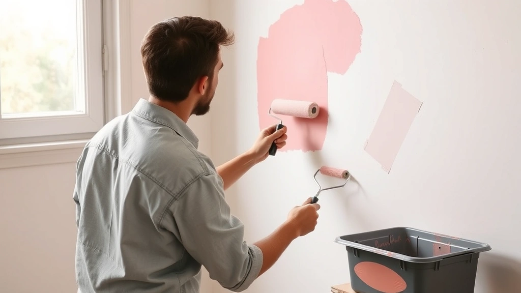
Create Sample Patches
Paint 2-3 foot square patches of your mixed pink on the actual wall or surface you’re painting. These samples must dry completely—typically 24 hours—before final evaluation. Wet paint appears darker and more saturated than dried paint, making proper drying time essential for accurate color assessment.
Observe in Different Lighting
View your sample patches in morning light, afternoon light, evening light, and artificial light. Colors shift dramatically depending on light source color temperature and angle. A pink that looks perfect at noon might appear too cool or warm at sunset. Extended observation in all lighting conditions reveals whether your choice truly works in your space.
Compare Against Reference Materials
Place your dried sample directly against your target color chip or fabric swatch. View from multiple distances and angles. If matching an existing color from another room, bring samples to that room for comparison under identical lighting. Small color variations that seem acceptable in one light often become obvious in another.
Live with Samples Before Committing
If possible, allow sample patches to remain on your wall for several days. Your eye adapts to color gradually, and living with samples reveals whether you truly love the shade or whether it feels too warm, cool, light, or saturated for your space and design scheme. This patience prevents repainting projects that result from impulsive decisions.
Make Final Adjustments
If your sample isn’t quite right, make targeted adjustments. Too pale? Add slightly more red. Too warm? Add a touch of blue. Too saturated? Add more white. Mix another small test batch, apply it to a different wall section, and repeat the observation process. This iterative approach ensures your final color is exactly what you envisioned.
For additional guidance on home improvement techniques and painting projects, explore comprehensive resources that complement your paint-mixing knowledge. Understanding broader painting principles enhances your ability to execute custom color projects successfully.
FAQ
What’s the best ratio for mixing basic pink paint?
There’s no universal ratio because it depends on your target shade and the specific paints you’re using. Generally, start with a 5:1 or 6:1 white-to-red ratio for medium pink, then adjust based on how light or saturated you want the result. Always add white incrementally rather than dumping large amounts at once.
Can I use acrylic paint instead of latex or oil paint?
Yes, the mixing principles remain identical across acrylic, latex, and oil paints. However, never mix different paint types together—acrylics and oils don’t blend properly. Choose one type and stick with it. Acrylics work well for crafts and small projects, while latex and oil paints suit larger applications like room painting.
How do I make pink paint less bright or saturated?
Add more white to reduce saturation and create a lighter, softer pink. Alternatively, add a tiny amount of gray, black, or the complementary color (green) to mute the brightness. Start with minimal amounts of these modifiers—a teaspoon per cup of paint—as they dramatically affect color.
Why does my mixed pink look different when it dries?
Wet paint appears darker and more saturated than dried paint due to light reflection differences in wet versus dry finishes. Always allow samples to dry completely before making final color judgments. This typically requires 24 hours for most paints, though some finishes take longer.
Can I store mixed pink paint for future use?
Yes, store mixed paint in airtight containers in cool conditions. Properly stored paint lasts months or even years. Label containers with the exact ratio used and paint brands involved. Before using stored paint, stir thoroughly to reblend any settling that may have occurred during storage.
What if I need a large quantity of pink paint?
For large projects, calculate the total paint volume needed, then scale your mixing ratios accordingly. If your test batch used a 6:1 white-to-red ratio and you need five times that amount, multiply both quantities by five. Mix in sections if your container is too small, then combine batches in a larger container, stirring thoroughly to ensure uniform color.
How do I match pink paint to a fabric or object?
Bring the fabric or object to a well-lit space and view it alongside your paint samples. Test multiple pink variations, as different undertones create dramatically different matches. Paint samples on white cardstock for accurate viewing. If the object will be in a specific room, test samples in that room under its actual lighting conditions.
Can I add other colors to create different pink shades?
Absolutely. Add yellow or orange for warm, coral pinks; add blue or purple for cool, mauve pinks; add gray for dusty pinks. Start with extremely small amounts—a teaspoon per cup—and increase gradually. These undertone adjustments dramatically affect the final result, so proceed cautiously and document every addition.
What’s the difference between tint, tone, and shade in pink paint?
A tint (pink) is created by adding white to red. A tone is created by adding gray to red, producing muted pinks. A shade is created by adding black to red, producing darker, less vibrant pinks. Understanding these distinctions helps you communicate your color vision and achieve precise results.
Should I use a paint mixer attachment on my drill?
For small batches (under one quart), hand-stirring works fine. For larger quantities, a drill-mounted mixer attachment saves significant time and effort while ensuring more thorough, uniform color distribution. They’re inexpensive and invaluable for serious paint projects.
Related Posts

Superscript in Google Docs: Expert Tips

Strikethrough in Excel: Easy Steps for Beginners
