
How to Make Red: A Color Mixing Guide
How to Make Red: A Complete Color Mixing Guide
Red is everywhere—it’s the color of passion, energy, and bold statements. Whether you’re painting a feature wall, mixing custom paint for a furniture project, or working with watercolors for an art piece, understanding how to make red is surprisingly essential knowledge for any DIY enthusiast. The thing is, red isn’t always as straightforward as grabbing a tube from the shelf. Sometimes you need to create it, adjust it, or understand its nuances to get exactly the shade you’re envisioning.
The beauty of color mixing lies in its simplicity and complexity all at once. While red is technically a primary color in traditional color theory, the journey to achieving the perfect red—whether it’s a deep crimson, a vibrant scarlet, or a warm burgundy—requires understanding some fundamental principles. This guide will walk you through everything you need to know about creating red in various mediums, from paint and dyes to digital applications.
What makes this guide different from generic color theory is that we’re focusing on practical, real-world applications. You’ll learn not just the theory, but how to actually execute these techniques in your next home improvement or creative project.
Understanding Red as a Primary Color
In traditional color theory, red is one of the three primary colors—alongside blue and yellow. This means that in a subtractive color model (which applies to paint, ink, and dyes), red cannot technically be created by mixing other colors together. It’s a foundational hue that exists on its own.
However—and this is the important part—not all reds are created equal. The red you see in a paint can depends on several factors: the pigments used, the undertones present, and how light interacts with the color. A true primary red sits right in the middle of the color spectrum, but manufacturers often create reds with slight variations. Some lean toward orange (warm reds), while others drift toward purple or blue (cool reds).
When you’re working on a DIY project, understanding whether you need a warm or cool red is crucial. A warm red with orange undertones will feel different on a living room wall than a cool red with blue undertones. The same principle applies when you’re learning how to make orange—undertones matter tremendously.
The key takeaway? If you’re starting with a primary red pigment, you already have your base. The real work comes in adjusting it to achieve the exact shade you need for your project.
Mixing Red with Paint
Here’s where things get practical. If you don’t have the exact red you need, or if you want to adjust a red you already have, mixing is your answer. Whether you’re working with acrylic, oil, watercolor, or latex paint, the fundamental principles remain consistent.
Starting with Your Base Red
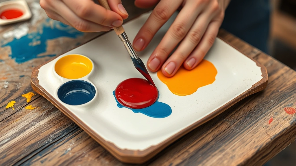
Begin with a high-quality red paint in whatever medium you’re using. For home improvement projects, latex or acrylic paints are most common. Squeeze out a generous amount on your palette—you’ll want enough to work with without running out mid-project.
The reason quality matters here is that cheaper paints often contain more fillers and fewer actual pigments. This means they’re harder to adjust and less vibrant to begin with. Think of it as starting with better ingredients for a recipe.
The Two-Color Mixing Method
If you’re starting completely from scratch without a red pigment, you’ll need to understand how colors interact. While you can’t technically mix red from other primary colors, you can create red-adjacent hues. For instance, mixing magenta with yellow produces a red-like color. Similarly, if you understand how to make purple and then adjust it with yellow, you’re moving toward red territory.
But let’s be honest—this is a workaround, not a true method. Your best bet is always starting with a red base and then modifying it from there.
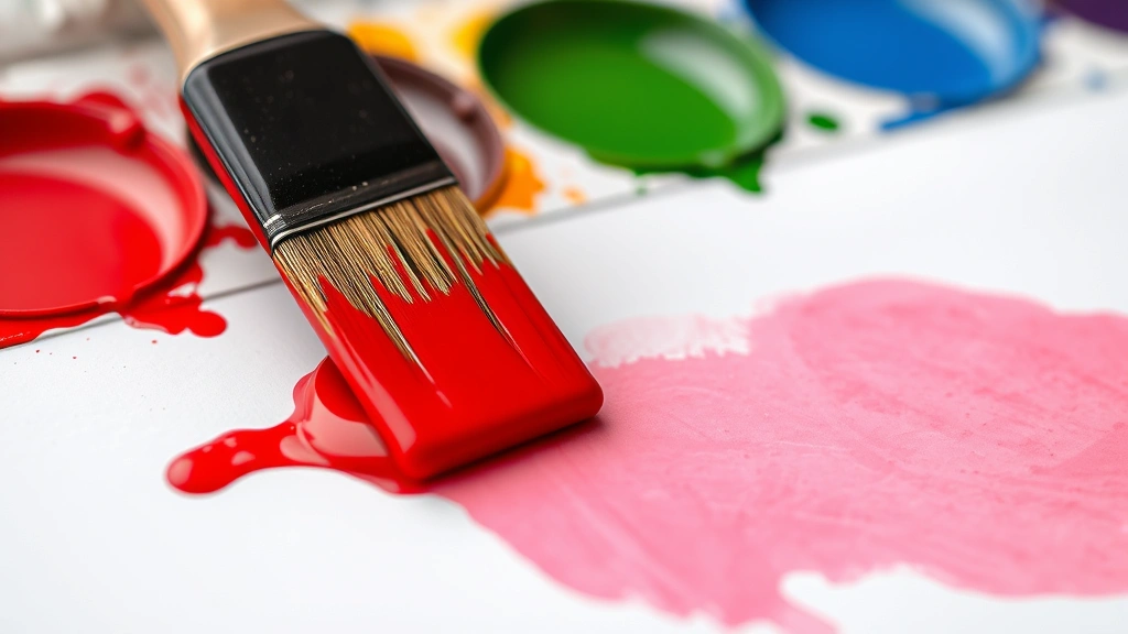
Creating Depth and Richness
Once you have your red base, you can deepen it by adding tiny amounts of its complementary color—which is cyan or turquoise. Don’t go overboard; you’re adding mere drops to maintain the red while reducing its brightness. This creates a more sophisticated, less flat appearance.
Alternatively, adding a small amount of black creates a darker red or maroon, perfect for creating visual depth in accent walls or furniture pieces. For a more burgundy tone, combine your red with a touch of brown or deep purple.
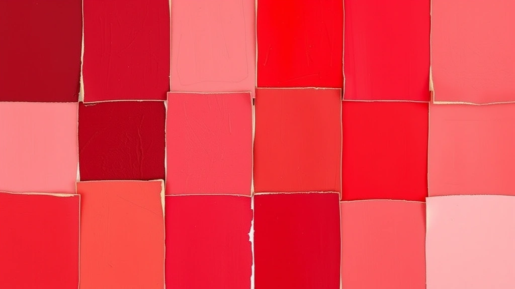
Achieving Different Shades of Red
The beauty of understanding color mixing is that one base red can become dozens of variations. Here are the most common adjustments you’ll want to make:
Warm Reds and Scarlets
To push your red toward the warm, energetic side, add small amounts of yellow or orange. This creates shades that feel inviting and vibrant. These warm reds work beautifully in kitchens, dining areas, or as accent colors in modern spaces. The warmth makes these spaces feel cozier and more intimate.
Cool Reds and Crimsons
Moving in the opposite direction, add touches of blue or purple to create cooler reds. These sophisticated shades feel more formal and elegant. If you’re interested in exploring this direction further, understanding how to make blue will give you better control over exactly how cool you want to go.
Muted and Dusty Reds
Sometimes you want red without the intensity. Add white to create lighter, more muted versions—think dusty rose or terracotta. This is perfect for bedrooms or spaces where you want color without overwhelming the room. Each addition of white softens the intensity while maintaining the red undertones.
Deep, Dark Reds
For dramatic effect, add black or dark brown in small increments. These deep reds create sophisticated, moody atmospheres. They’re excellent for accent walls, trim work, or creating visual weight in larger spaces. Be cautious with black—it’s easy to go too far and end up with brown instead of deep red.
Working with Red in Different Mediums
The principles of color mixing remain consistent across mediums, but the execution varies slightly. Understanding these differences ensures success whether you’re painting walls, staining wood, or working with fabric dyes.
Acrylic and Latex Paint
These water-based options are forgiving and quick-drying. Mix on a palette using a palette knife or brush, testing your mixture on a scrap surface before committing to your project. The advantage? If you mess up, you can paint over it once it dries. For large projects like walls, always mix enough of your custom color to complete the job—matching a mixed color later is nearly impossible.
Oil Paint
Oil paints require longer drying times but offer richer color depth. Mix on a palette using a palette knife, and remember that oils are more concentrated than acrylics, so you’ll need less pigment adjustment. If you’re new to oils, practice on small test pieces first.
Watercolor
Watercolor mixing happens on the paper itself or on a wet palette. The transparency of watercolors means your red will look different on white paper than on colored paper. Always test your mixture before applying it to your final piece. The beautiful thing about watercolor is that layering creates depth—you can build reds by layering lighter washes.
Fabric Dyes
If you’re working with textiles, red dyes follow similar principles but require proper fixation. Always follow manufacturer instructions for setting dyes. The advantage of fabric dyes is that you can experiment on test swatches before committing to your entire project.
Color Theory and Red Combinations
Understanding how red interacts with other colors elevates your design choices. This knowledge applies whether you’re choosing complementary wall colors or coordinating a multi-colored furniture refinishing project.
Complementary Colors to Red
Red’s complementary color is cyan (blue-green). This pairing creates high contrast and visual excitement. Think of a red accent wall with cyan accessories—the combination is vibrant and energetic. However, this pairing isn’t for the faint of heart; it demands confidence in your design choices.
Analogous Colors to Red
Colors adjacent to red on the color wheel—orange and purple—create harmonious, pleasing combinations. If you want to learn more about these adjacent hues, exploring how to make green and how to make yellow will deepen your understanding of the entire color spectrum and how colors relate to one another.
Triadic Color Schemes
Red, yellow, and blue create a triadic scheme—balanced and vibrant. This works well in children’s spaces or creative areas. The key is using these colors in balanced proportions; don’t let one dominate unless that’s your intention.
Red with Neutrals
Red pairs beautifully with whites, grays, and blacks. This combination lets red shine without competing colors. It’s a sophisticated approach perfect for modern or minimalist spaces.
Troubleshooting Common Mixing Problems
Even experienced DIYers encounter color mixing challenges. Here’s how to solve the most common issues:
Your Red Looks Too Orange or Too Purple
If your red has shifted toward orange, you’ve likely added too much yellow. Counteract this by adding a tiny amount of blue. Conversely, if it’s too purple, add a microscopic amount of yellow to warm it up. Remember: you’re making micro-adjustments, not major overhauls.
The Color Looks Muddy or Brown
This typically happens when you’ve added too much of a complementary color or too much black. Start over with fresh red and make smaller adjustments. If you’re interested in browns for other projects, understanding how to make brown gravy might seem unrelated, but it teaches you about color depth and richness in different contexts.
Your Mixed Color Looks Different Once Dry
This is completely normal. Wet paint appears darker and more saturated than dry paint. Always test your mixture on a scrap surface and let it dry completely before judging the color. Most paints lighten by 1-2 shades as they dry.
You Can’t Reproduce Your Custom Red
This is why documentation matters. When you create a custom color you love, write down exactly what you mixed: how much base red, how many drops of each adjustment color, and the ratio. Take a photo of the wet and dry color. This becomes your recipe for future projects.
For professional-grade matching, consider using paint matching technology available at most major paint retailers. Bring a sample of your mixed color, and they can create a custom formula you can order again.
Frequently Asked Questions
Can You Make Red Without Red Paint?
Technically, no. Red is a primary color in subtractive color mixing, meaning it cannot be created by combining other pigments. However, you can create red-like hues by mixing magenta with yellow, though the result won’t be a true primary red. For any serious project, starting with a red base is always best.
What’s the Best Way to Test a Custom Red Before Painting a Whole Room?
Paint a large test swatch (at least 2×2 feet) on your wall and observe it at different times of day. Lighting dramatically affects how colors appear. What looks perfect in morning light might feel different in afternoon or evening light. Live with the test swatch for a few days before committing.
How Much Red Do I Need to Adjust Another Color to Red?
This depends on your starting color and desired outcome. If you’re starting with magenta, you might need equal parts magenta and yellow. If you’re starting with a red base and just adjusting the tone, you’ll use tiny amounts—drops, not tablespoons—of adjustment colors. Always start small; you can add more but can’t take it out.
Does the Type of Paint Matter When Mixing Red?
Yes. Oil paints mix differently than acrylics, which mix differently than watercolors. The pigment concentration varies by medium. Always follow best practices for your specific medium. Additionally, mixing high-quality paints produces better results than mixing budget options.
Why Does My Red Look Different on My Walls Than on the Paint Chip?
Paint chips are small and viewed under store lighting, which is typically bright and cool. Your walls are larger, viewed under your home’s specific lighting, and affected by surrounding colors and finishes. This is why testing is crucial. The paint chip is a starting point, not a guarantee.
Can You Mix Red from Food Coloring?
Food coloring is already red, so you’re not mixing it—you’re using it as-is. However, food coloring is designed for culinary use, not painting or dyeing projects. For painting, use actual paint pigments. For dyeing fabric, use fabric dyes. For culinary projects, food coloring works perfectly, though it won’t help you understand paint color mixing.
What’s the Difference Between Mixing Red and Creating a Red Stain?
Paint and stains are fundamentally different products. Paint sits on top of surfaces, while stains penetrate them. When working with stains, you’re still mixing pigments, but the application and final appearance differ significantly. Always use products designed for your specific surface and project type.
Related Posts

How Long to Boil Lobster Tails: Cooking Guide

How Long to Fly from New York to London? Travel Times
