
How to Make Purple: A Simple Guide
How to Make Purple: A Simple Guide to Color Mixing and DIY Applications
Purple has always held a special place in design and creativity. Whether you’re painting a bedroom accent wall, mixing custom paint for a furniture refresh, or tackling an art project, knowing how to make purple opens up a world of possibilities. The beauty of this color lies in its versatility—it can be bold and dramatic or soft and sophisticated, depending on how you blend it.
The truth is, making purple isn’t complicated. You probably learned the basics in elementary school, but there’s more nuance to it than simply combining two primary colors. Understanding the science behind color mixing, the different purple variations you can create, and how to apply these techniques to your home improvement projects will transform your DIY game.
In this comprehensive guide, we’ll walk you through everything you need to know about creating purple, from basic color theory to practical applications for your next home project. Whether you’re a seasoned DIY enthusiast or picking up a paintbrush for the first time, you’ll find actionable steps and creative inspiration here.
The Basics: Red and Blue Make Purple
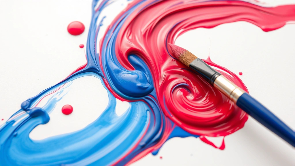
Let’s start with the fundamental principle: purple is created by mixing red and blue. This is the cornerstone of color theory and the foundation for understanding how to create this beautiful hue. When you combine these two primary colors in equal proportions, you get a true, balanced purple that sits perfectly between them on the color wheel.
The reason this works comes down to light and pigment. When red and blue light mix, they create the perception of purple. With paint pigments, the same principle applies, though the results depend heavily on the quality and undertones of your starting colors. This is why not all reds and blues produce the same purple—a warm red mixed with a cool blue creates a different result than a cool red with a warm blue.
For DIY projects around your home, this simple formula becomes your starting point. If you’re working with acrylic paint, watercolor, or even house paint, the same rule applies. The key is understanding that you have control over the outcome by adjusting your ratios and understanding your color sources.
Understanding Color Theory and Proportions
While the basic recipe is straightforward, the real artistry comes in understanding proportions and color theory. Equal parts red and blue give you a true purple, but what if you want something different?
If you add more blue to your mixture, you’ll shift toward a cooler, more blue-violet tone. This creates what designers call “periwinkle” or “violet”—colors that lean toward the blue side of the spectrum. Conversely, adding more red creates a warmer, more magenta-leaning purple. This variation is crucial for achieving specific aesthetic goals in your space.
The undertones of your starting colors matter tremendously. Understanding how base materials work teaches us that foundation matters in every project. Similarly, a bright, warm red paired with a deep, cool blue produces entirely different purples than a muted red and a bright blue. Experimenting with different combinations helps you develop an intuition for color mixing.
Professional painters often use the 60-30-10 rule as a starting point: 60% of your dominant color (let’s say blue), 30% of your secondary color (red), and 10% for adjustments. This gives you a framework, though your specific project might require tweaking. Start with these proportions and adjust based on what you’re seeing.
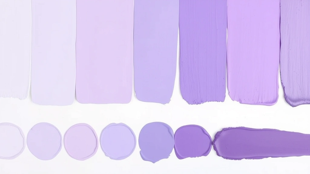
Creating Different Shades of Purple
Once you’ve mastered the basic purple, the possibilities expand exponentially. Adding white creates pastels—soft lavender and lilac tones perfect for bedrooms and bathrooms. Adding black creates deeper, more sophisticated shades like plum and eggplant. Adding gray gives you muted, sophisticated purples that work beautifully in modern interiors.
Each adjustment changes the mood and application of your color. Light purples feel airy and calming, making them ideal for spaces where you want relaxation. Deep purples feel luxurious and dramatic, perfect for creating focal points or adding sophistication to a room. The versatility of purple is one of its greatest strengths as a design color.
When adjusting your purple, remember that a little goes a long way. Add white, black, or gray in small increments—perhaps 5-10% at a time—and mix thoroughly before assessing. It’s much easier to add more than to correct an overly lightened or darkened batch. Keep detailed notes of your ratios if you’re working on a larger project that requires multiple batches.
Purple Paint for Home Projects
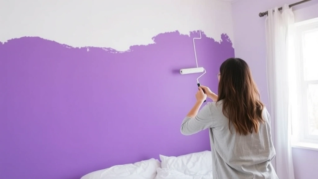
When you’re ready to move beyond experimentation and tackle an actual home improvement project, working with purple paint opens up exciting possibilities. Whether you’re painting walls, furniture, or accent pieces, the principles remain consistent.
For wall paint, consider purchasing samples from your local paint supplier. Most retailers offer small quantities specifically for testing colors in your space. This investment is worth it because lighting, existing furnishings, and surrounding colors all affect how your purple appears. A purple that looks stunning in the store might feel different once it’s on your wall under your specific lighting conditions.
If you’re custom-mixing paint, work with your local paint professional who has access to industrial-grade pigments and mixing equipment. They can create consistent batches and help you achieve specific color targets. When exploring creative DIY projects, remember that paint mixing is one area where professional guidance often saves time and frustration.
For furniture projects, acrylic craft paints or specialty furniture paints work beautifully. These come pre-mixed in countless purple variations, eliminating the guesswork if you prefer convenience. However, if you want a custom shade for a specific piece, mixing your own allows for personalization that store-bought options can’t match.
Always prepare your surfaces properly before painting. Sand, prime if necessary, and apply thin, even coats. Purple can be a bold color, so proper preparation ensures professional-looking results. This Old House offers comprehensive guidance on room painting techniques that applies regardless of your color choice.
Natural and Alternative Methods
Beyond commercial paints and pigments, you can create purple using natural materials. This approach appeals to eco-conscious DIYers and adds an educational element to projects, especially those involving children.
Beet juice creates a natural purple dye that works beautifully on fabrics, paper, and even some surfaces. Boil beets, strain the liquid, and you have a natural dye base. Red cabbage also produces purple hues—the exact shade depends on the pH of your liquid. Adding acidic substances like vinegar shifts the color, while alkaline substances create different tones.
For art projects, mixing watercolors or food coloring with water creates temporary purple solutions perfect for experimentation. These methods teach color theory without requiring expensive supplies. If you’re working with children or exploring other creative DIY endeavors, natural methods provide engaging, hands-on learning opportunities.
Fabric dyes offer another avenue. Permanent dyes create vibrant purples on textiles, allowing you to customize fabrics for home projects like pillows, curtains, or upholstered pieces. Always follow manufacturer instructions carefully, as dye processes vary significantly by product type.
Common Mistakes to Avoid
Even experienced DIYers make purple-mixing mistakes. Awareness helps you sidestep these pitfalls and achieve better results faster.
The most common error is using unbalanced starting colors. If your red is very warm (leaning orange) and your blue is cool (leaning green), they won’t mix into a true purple. Instead, you’ll get muddy, brownish tones. Always check your color sources before mixing. Quality matters—cheap paints often have poor pigmentation and produce disappointing results.
Another frequent mistake is adding too much white or black at once. Beginners often over-correct, creating washed-out or overly dark purples. Remember that adjustments should be incremental. A little adjustment goes far with color mixing.
Not mixing thoroughly creates uneven color. Whether you’re using a paintbrush, palette knife, or mixer, ensure your colors are completely blended before assessing the result. Partial mixing creates streaky, inconsistent purples that look unprofessional.
Finally, many DIYers fail to account for how color appears under different lighting. The same purple looks different under warm incandescent bulbs versus cool LED lights. Test your purple in the actual space where it will be used, ideally at different times of day.
Purple in Interior Design and Decor
Understanding how to make purple is only half the battle—knowing how to use it effectively in your space completes the picture. Purple works beautifully in various design contexts when applied thoughtfully.
In modern minimalist spaces, muted, sophisticated purples create visual interest without overwhelming. Pair them with neutral walls and simple furnishings for a contemporary feel. In eclectic or bohemian interiors, bold, vibrant purples become statement colors that energize the space.
Purple also pairs beautifully with specific complementary colors. Yellow creates dynamic contrast, while silver and gold accents add luxury. Soft purples work wonderfully with whites, creams, and pale grays for serene, spa-like atmospheres. When learning about preparation and precision in projects, the same careful attention applies to color coordination in design.
Consider your room’s natural light when incorporating purple. North-facing rooms with cool light can handle deeper purples without feeling heavy. South-facing rooms with warm light benefit from lighter, cooler-toned purples that won’t feel oppressive. This practical consideration ensures your purple choices enhance rather than diminish your space.
Beyond walls, purple works in accent pieces, artwork, textiles, and decorative objects. A purple accent chair, throw pillows, or framed art allows you to experiment with the color without committing to painting walls. This flexibility makes purple accessible for renters and those who prefer frequently updated decor.
Family Handyman provides step-by-step instructions for room painting projects that apply regardless of your color selection. Their detailed approach ensures professional results whether you’re working with purple or any other hue.
When incorporating purple into various home projects and endeavors, remember that personal preference always trumps design rules. If you love purple, find ways to incorporate it that feel authentic to your space and lifestyle.
Home Depot’s color resources offer visualization tools and expert advice for selecting and mixing paint colors. These resources complement your DIY knowledge with professional insights.
Frequently Asked Questions
What ratio of red to blue makes the best purple?
A 1:1 ratio of red to blue creates a true, balanced purple. However, “best” depends on your specific project and preferences. Some projects benefit from slightly more blue (creating cooler violets) or slightly more red (creating warmer magentas). Start with equal parts and adjust based on your desired outcome.
Can I make purple with other color combinations?
While red and blue are the primary combination, you can create purple-adjacent colors through other mixes. Magenta mixed with blue creates purple tones, and certain red-violet combinations work as well. However, the most reliable, consistent method remains mixing true red with true blue.
Why does my homemade purple look muddy?
Muddy purple typically results from using colors with conflicting undertones or adding too much of one color. Ensure your red and blue are true colors without strong secondary undertones. Also, avoid over-mixing or adding too many additional colors, which muddies the hue.
How do I make light purple or lavender?
Add white to your purple mixture gradually—perhaps 10-20% white initially—and adjust until you reach your desired lightness. Remember that adding white also affects the saturation and vibrancy of the color, creating softer, more pastel tones.
What’s the difference between purple and violet?
Purple and violet are closely related but technically different. Violet is a spectral color (a pure color of light), while purple is a non-spectral color created by mixing red and blue light. In practical color mixing, violet refers to colors that lean more blue, while purple is more balanced. In design, the terms are often used interchangeably.
Can I make purple with digital colors differently than with paint?
Digital color mixing works differently from paint mixing because it uses additive color (light) rather than subtractive color (pigment). In digital design, purple is created by combining red and blue light values, but the exact RGB values differ from paint mixing ratios. However, the basic principle—combining red and blue—remains the same.
How do I make my purple paint last longer?
Store mixed paint in airtight containers away from extreme temperatures. Label containers with the exact ratio used so you can recreate the color if needed. Keep records of your mixing process—this documentation proves invaluable for future projects requiring color consistency.
Is it cheaper to mix my own purple paint?
Sometimes, but not always. Buying small quantities of red and blue paint to mix your own can cost more than purchasing pre-mixed purple, especially for small projects. However, for large projects or custom color work, mixing your own offers better value and unlimited customization options.
Related Posts

How Long to Boil Lobster Tails: Cooking Guide

How Long to Fly from New York to London? Travel Times
