
How to Make Orange: Expert Color Mixing Guide
How to Make Orange: Expert Color Mixing Guide
Orange is one of those colors that feels warm, inviting, and energetic all at once. Whether you’re tackling a DIY home painting project, mixing paints for an accent wall, or working on a craft project, knowing how to make orange is a fundamental skill that opens up countless creative possibilities. The beauty of orange is that it sits right in that sweet spot between the vibrancy of red and the cheerfulness of yellow—and once you understand the basics, you’ll be mixing custom shades like a pro.
The good news? Making orange isn’t rocket science. It’s actually one of the most straightforward color combinations in the mixing world, but there’s definitely more to it than just slapping red and yellow together. We’re going to walk you through everything from the basic formula to advanced techniques for achieving those Instagram-worthy, perfectly balanced oranges that’ll make your space look professionally designed.
If you’ve ever stood in front of a paint sample display feeling overwhelmed, or mixed a batch of orange that looked more like rust than the vibrant hue you envisioned, this guide is for you. Let’s dive into the art and science of orange creation.
The Basic Formula: Red and Yellow
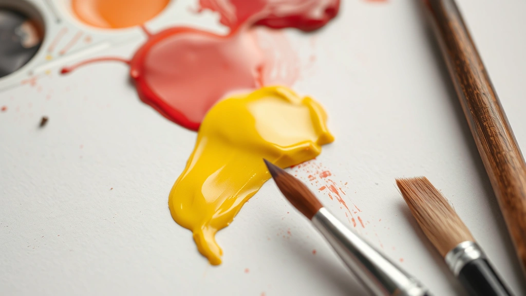
At its core, orange is born from a simple marriage: red plus yellow equals orange. This is color mixing 101, and it’s the foundation for everything else we’ll discuss. But here’s where it gets interesting—not all reds are created equal, and neither are all yellows. The specific shades you choose will dramatically impact your final orange.
When you’re working with primary colors, you’ve got options. A true red (sometimes called cardinal red) mixed with a bright, pure yellow will give you a vibrant, almost neon-like orange. If you use a cooler red with hints of blue in it, you’ll end up with a more muted, brownish-orange. Similarly, a warm yellow with golden undertones will create a richer orange than a lemon-yellow would.
The ratio matters too, but we’ll get into the specifics in the next section. For now, just understand that you’re working with two primary colors to create a secondary color. This is the foundation of the color wheel, and it applies whether you’re mixing acrylic paint, oil paint, watercolors, or even food coloring.
If you’re curious about the broader color theory, you might want to explore how to make other colors too. For instance, understanding how to make yellow gives you deeper insight into color relationships, and knowing how to make purple shows you how complementary colors work in opposition to orange on the color wheel.
Getting the Ratios Right
This is where precision matters. The classic ratio for a balanced, true orange is 1 part red to 2 parts yellow. This means if you’re using a tablespoon of red, you’d add two tablespoons of yellow. Start with this ratio and adjust from there based on what you’re seeing.
Here’s a practical approach: squeeze out a small amount of red onto your mixing surface (a palette, white plate, or mixing tray works great). Then add yellow gradually, stirring as you go. This gives you control and prevents you from overshooting with yellow. You can always add more yellow, but taking it out is impossible, so patience is your friend here.
The reason this ratio works is rooted in color theory and pigment strength. Yellow pigments are generally less dominant than red pigments, so you need more yellow to balance the intensity. If you used equal parts, your orange would lean heavily toward red and look more like a burnt red than a true orange.
- For a red-orange: Use a 1:1.5 ratio (more red, less yellow)
- For a balanced orange: Use a 1:2 ratio (classic proportion)
- For a yellow-orange: Use a 1:3 ratio (more yellow, less red)
Test your mixture on a white surface before committing to a large batch. The color will look different on white than it will on your actual project surface, but white gives you the truest representation of what you’ve mixed.
Orange in Different Paint Types
The medium you’re working with changes how you approach orange mixing. Let’s break down the most common scenarios you’ll encounter in home improvement and DIY projects.
Acrylic Paint: This is probably what most DIYers reach for, and it’s forgiving. Acrylics dry quickly, so mix small batches and test them immediately. The color won’t shift much as it dries, so what you see is what you get. If you’re painting walls or doing furniture projects, acrylics are your reliable friend.
Oil Paint: Oil-based paints have more depth and richness, but they’re less forgiving when it comes to mixing. You’ll need to use paint thinner to adjust consistency, and colors can shift slightly as they cure. Oil paints are typically reserved for more advanced projects or when you want that luxe, gallery-quality finish.
Watercolor: Mixing watercolors requires a lighter touch. Use less pigment and more water. Watercolors are transparent, so your orange will have a luminous quality that acrylics won’t replicate. This is perfect for artistic projects but less practical for wall painting.
Food Coloring: If you’re mixing orange for baking or cooking projects, you’re working with a completely different beast. Start with just a drop or two of red and yellow food coloring—it’s potent stuff. Mix it into your frosting or batter thoroughly before adding more. The intensity is deceptive.
For most home improvement projects, you’ll be working with either acrylic latex paint or oil-based paint. Check your paint can’s specifications before you start mixing to ensure you’re using the right base.
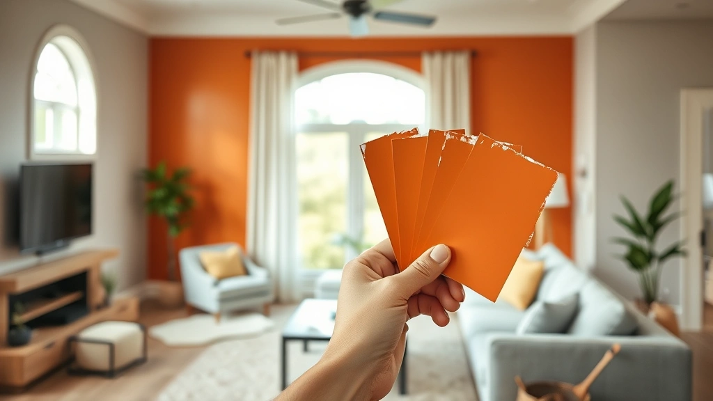
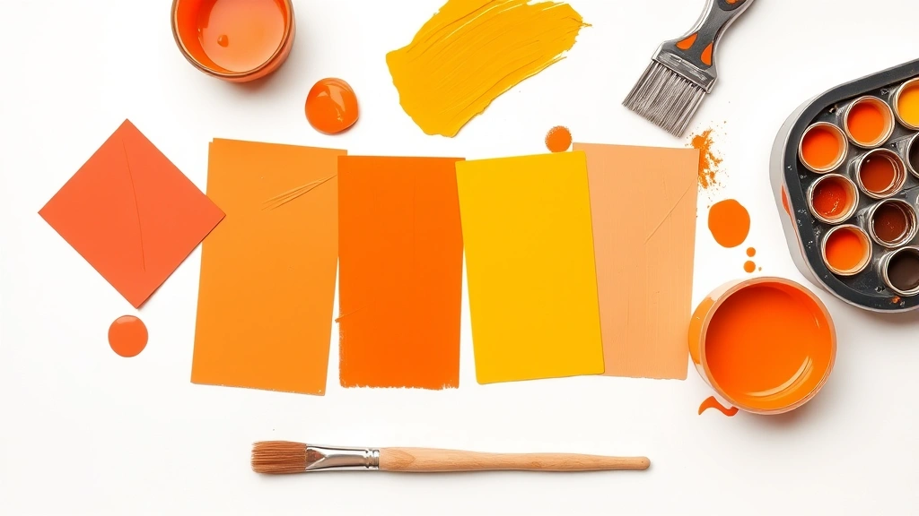
Creating Custom Orange Shades
Once you’ve mastered the basic orange, the real fun begins. There are dozens of orange variations, and knowing how to create them gives you serious creative control over your space.
Burnt Orange: This sophisticated, earthy orange is perfect for accent walls or rustic-themed rooms. To create it, start with your base orange and add a touch of brown (which you can make by mixing red and green together, or simply add a tiny bit of black). The result is a deeper, more muted orange with serious character.
Coral Orange: This is a lighter, more playful version. Add white to your orange to create a softer, more pastel-like shade. Coral works beautifully in bedrooms or living spaces where you want warmth without intensity. The white also increases coverage, so you might need fewer coats.
Tangerine Orange: Brighter and more saturated than a standard orange, tangerine is achieved by using more vibrant reds and yellows and keeping the mixture pure without any additives. This is your go-to for spaces that need energy and vibrancy.
If you’re working on a larger project and need consistency, mix more than you think you’ll need and store it in an airtight container. Paint colors can shift slightly between batches, so having extra ensures uniformity across your entire project.
Understanding color relationships helps too. If you want to learn about complementary colors and how they interact, exploring how to make blue is enlightening, since blue and orange sit directly opposite each other on the color wheel. Similarly, how to make green can teach you about analogous color schemes when paired with orange.
Common Mixing Mistakes to Avoid
Even experienced DIYers slip up sometimes. Here are the pitfalls to watch out for:
Using Too Much Red: This is the number one mistake. People get excited with red and end up with a muddy, dark orange that looks more like a rust stain than a intentional design choice. Remember that 1:2 ratio—yellow should dominate in volume.
Forgetting About Undertones: Not all reds are warm, and not all yellows are bright. A cool red with blue undertones will give you a completely different orange than a warm red. Check your paint swatches under natural light and artificial light before committing.
Mixing in Black Instead of Darkening Naturally: If you need a darker orange, resist the urge to add black. Black can make your orange look gray and lifeless. Instead, add a complementary color like a tiny bit of blue, or use how to make purple principles—adding a touch of purple can deepen orange beautifully while maintaining its warmth.
Skipping the Test Patch: Never paint an entire wall with a color you’ve just mixed. Paint a large test patch and observe it under different lighting conditions. What looks perfect in morning light might look off in evening light.
Not Accounting for Sheen and Surface: The same orange will look different on flat paint versus glossy paint, and it’ll look different on drywall versus wood. Test your color on the actual surface you’re painting whenever possible.
Application Tips for Your Project
Mixing the perfect orange is only half the battle. How you apply it matters just as much.
Prep Your Surface: Clean walls thoroughly and prime if necessary. A good primer ensures even color coverage and prevents the underlying surface from affecting your orange. This is especially important if you’re painting over a dark color.
Use Quality Tools: A cheap brush or roller will leave streaks and uneven coverage. Invest in decent brushes and rollers—they make a tangible difference in the final result. For cutting in around edges, a 2-inch angled brush is your best friend.
Apply Multiple Coats: Most custom-mixed oranges need at least two coats for full coverage. Wait for the first coat to dry completely before applying the second. Patience here pays dividends in the final appearance.
Consider Lighting: Orange’s warmth is affected by lighting. In rooms with cool, blue-toned lighting, orange can look too warm or even slightly red. In rooms with warm, yellow-toned lighting, orange can feel overwhelming. If possible, test your orange under the actual lighting conditions of your space.
For comprehensive guidance on paint application and wall preparation, This Old House’s painting guide offers excellent step-by-step instructions.
Frequently Asked Questions
What if my orange looks too red or too yellow?
If it’s too red, add more yellow in small increments. If it’s too yellow, add a touch more red—but be careful with red since it’s more potent. Mix, check, and adjust gradually. It’s easier to add than to remove.
Can I make orange without red?
Not really. Orange requires red as one of its primary components. However, you can experiment with different reds (crimson, scarlet, burgundy) to achieve different orange tones. But you always need red in the mix.
How do I make orange lighter or darker?
For lighter: add white. For darker: add a tiny amount of its complementary color (blue) or a touch of brown. Never add black, as it will muddy the color and make it look gray.
Does the type of yellow matter?
Absolutely. A warm, golden yellow will create a richer orange than a cool, lemon yellow. For home projects, a standard primary yellow works well, but experimenting with different yellows can yield interesting variations.
How long will my mixed orange paint last?
Store mixed paint in an airtight container in a cool place. It should last several months to a year, though latex paint is generally stable longer than oil-based paint. Always stir well before using stored paint.
What’s the difference between orange and coral?
Coral is a lighter, more peachy version of orange created by adding white. It’s softer and more muted, while orange is more saturated and vibrant. Coral works well for spaces that need warmth without intensity.
Can I use orange in every room?
Orange works in most spaces, but its intensity matters. Burnt orange is sophisticated and works in living rooms or dens. Coral is calming and suits bedrooms. Bright, tangerine orange energizes kitchens and creative spaces. Consider the room’s purpose and lighting before committing.
Related Posts

How Long to Boil Lobster Tails: Cooking Guide

How Long to Fly from New York to London? Travel Times
