
How to Make Orange: A Color Mixing Guide
How to Make Orange: A Color Mixing Guide for DIY Projects and Home Design
Orange is everywhere in design and décor, from accent walls that radiate warmth to carefully curated fall palettes that transform living spaces. But here’s the thing: not all oranges are created equal. Whether you’re painting a feature wall, mixing custom paint for a renovation project, or tackling an art project, understanding how to make orange gives you control over the exact shade you envision. This guide breaks down the science and practicality of color mixing so you can achieve that perfect burnt sienna, vibrant tangerine, or soft peachy tone your space deserves.
The beauty of learning color theory isn’t just academic—it’s liberating. Once you understand the fundamentals of mixing orange, you’ll stop being limited by what’s available on store shelves. You’ll have the confidence to experiment, adjust, and create custom hues that match your specific design goals. Whether you’re a seasoned DIY enthusiast or picking up a paintbrush for the first time, this comprehensive guide will walk you through every method, from basic primary color mixing to advanced techniques for achieving those elusive, sophisticated orange variations.
Understanding Primary Colors and Orange
Before diving into the mechanics of creating orange, let’s establish the foundation. In traditional color theory, there are three primary colors: red, yellow, and blue. These are the building blocks from which all other colors theoretically derive. Orange sits comfortably in the secondary color category, meaning it’s created by combining two primary colors.
The reason orange matters in this hierarchy is that it represents the perfect intersection between warmth and vibrancy. Unlike how to make yellow, which leans toward brightness and airiness, orange brings depth and energy. It’s warm without being aggressive, and it communicates both comfort and excitement—which explains why designers love it for everything from kitchens to living rooms.
Understanding this relationship also helps you appreciate why different combinations of red and yellow produce different orange results. A cooler red mixed with a warmer yellow creates an entirely different orange than a warm red mixed with a cool yellow. This nuance is where the real skill in color mixing reveals itself.
The Basic Recipe: Red and Yellow
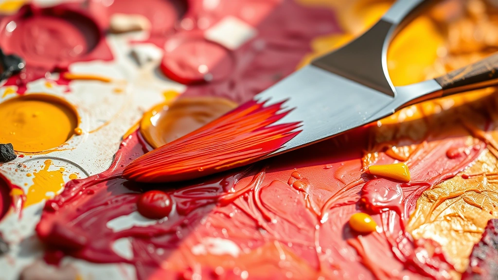
Let’s get straight to it: orange is made by combining red and yellow. Simple enough, right? Well, yes and no. While the basic formula is straightforward, the execution requires attention to detail and understanding of color properties.
The Standard Ratio
The most common starting point is a 1:1 ratio—equal parts red and yellow. This typically produces a balanced, vibrant orange that works beautifully as a primary wall color or accent. However, this isn’t a universal rule. Your specific result depends on several factors:
- The undertone of your red: Is it warm (leaning toward orange already) or cool (leaning toward purple)?
- The undertone of your yellow: Is it warm (golden) or cool (lemon)?
- The pigment quality: Professional-grade paints and pigments produce cleaner, more predictable results than student-grade materials
- The medium: Mixing orange in acrylic paint differs from mixing it in watercolor or oil
If you want a more golden, warm orange, increase your yellow slightly—try a 1:1.5 ratio (more yellow than red). For a deeper, more red-toned orange, reverse this and use slightly more red. The beauty is that you control the outcome through these micro-adjustments.
Practical Mixing Steps
Here’s how to actually mix orange in a controlled, repeatable way:
- Start with your red. Pour or squeeze a modest amount into a clean mixing container or palette
- Add yellow in small increments, stirring or blending thoroughly after each addition
- Mix from the center outward, ensuring no streaks of unmixed color remain
- Test your result on a scrap surface or paper before committing to a large project
- Take notes on your ratios so you can replicate the exact shade if needed
This methodical approach prevents you from overshooting and ending up with too much orange that you then have to adjust. It’s far easier to add more yellow to a red base than to rescue an orange that’s gone too yellow.
Mixing Orange with Acrylic and Oil Paints
The medium you’re working with dramatically affects how you approach orange mixing. Acrylic and oil paints behave differently, and understanding these distinctions ensures professional results.
Acrylic Paint Mixing
Acrylic is the go-to for most DIY home projects, and for good reason. It’s forgiving, dries quickly, and cleans up with water. When mixing orange with acrylics:
- Use a palette knife or old credit card for mixing—this gives you better control than a brush
- Work on a non-porous surface like a ceramic plate or dedicated mixing palette
- Mix thoroughly to ensure even color distribution; streaky orange looks amateurish
- Remember that acrylic dries slightly darker than it appears wet, so your mixed orange will shift slightly as it cures
- Always test on a sample board before painting your walls or furniture
Pro tip: Keep a spray bottle of water nearby. Acrylic dries fast, and if your mixture starts to set up before you’ve finished using it, a light mist keeps it workable for another minute or two.
Oil Paint Mixing
Oil paints offer richer, more luminous results but require more care during mixing. They’re slower to dry, which gives you more working time but demands patience. When working with oils:
- Use odorless mineral spirits or linseed oil as your medium for extending and adjusting consistency
- Mix on a glass or ceramic surface with a palette knife
- Oil and acrylic don’t mix, so keep your tools and surfaces dedicated to one or the other
- Oil paint orange takes longer to cure, so plan your project timeline accordingly
- Ventilation is essential when working with oils, so always work in a well-aired space
The advantage of oils is that they maintain their color consistency as they dry, unlike acrylics. This means your mixed orange will look the same when dry as it did when wet—a significant advantage for matching colors across multiple sessions.
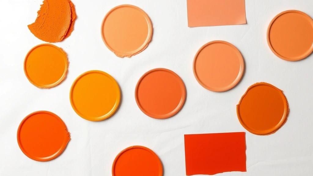
Creating Orange Variations and Shades
Once you’ve mastered basic orange mixing, the real fun begins. Creating variations opens up a spectrum of possibilities, each with different design applications and emotional impacts.
Burnt Orange
Burnt orange is sophisticated, warm, and perfect for creating cozy, upscale spaces. To create it, mix your basic orange and then add a small amount of brown or black. Brown is preferable because it maintains warmth while darkening. Add conservatively—you can always add more, but you can’t remove it. This shade works beautifully on accent walls, especially in bedrooms or studies.
Peach
Peach is orange’s softer sibling, and it’s created by lightening your orange with white. This is where having quality white paint matters. Some whites have warm undertones while others lean cool. For peach, use a warm white. A basic ratio is 1 part orange to 2-3 parts white, but adjust based on how light you want the final result. Peach is excellent for creating airy, inviting spaces without the intensity of full orange.
Tangerine
For a more vibrant, energetic orange, increase the saturation by using more yellow in your initial mix and ensuring your reds and yellows are both highly pigmented. Tangerine works wonderfully in kitchens, playrooms, or any space where you want to energize rather than soothe. This shade also pairs well with complementary colors like how to make blue for striking contrast.
Terracotta
Terracotta evokes natural clay and earth, making it perfect for rustic or Mediterranean-inspired spaces. Create it by mixing orange with a touch of brown and a hint of red. The key is achieving that earthy, slightly muted quality. This shade is forgiving and works in virtually any room, from bathrooms to kitchens.
Coral
Coral leans toward pink while maintaining orange’s warmth. Create it by mixing your orange with a small amount of pink or magenta. Start conservative—coral can easily become too pink if you’re not careful. This shade is trendy, youthful, and works especially well in spaces meant to feel energetic and contemporary.
Advanced Color Mixing Techniques
For those ready to move beyond basic mixing, several advanced techniques yield sophisticated results.
The Glazing Method
Instead of mixing colors together completely, you can layer thin, transparent washes of color. Paint a base layer of red, then glaze a yellow wash over it. This creates optical color mixing where your eye blends the colors, resulting in a more vibrant orange than direct mixing. This technique is popular in fine art and can create stunning effects on furniture or accent walls.
Color Temperature Adjustment
Understanding warm and cool versions of colors allows you to create oranges with specific moods. A warm orange (more red, warmer yellow) feels cozy and intimate. A cool orange (cooler red, cooler yellow) feels more contemporary and sophisticated. By consciously selecting your red and yellow based on their undertones, you can dial in the exact emotional quality your space needs.
Saturation Control
Saturation refers to how pure and intense a color is. To reduce saturation and create a muted, sophisticated orange, add a tiny amount of the complementary color (blue). This sounds counterintuitive, but adding a color’s complement creates a more complex, refined hue. Add blue drop by drop—this technique is potent and requires restraint.
Pigment Layering
When working with high-quality paints or pigments, you can achieve complexity by using multiple orange-creating combinations. For instance, mixing cadmium red with lemon yellow creates a different orange than alizarin red with golden yellow. By understanding these distinctions, you can create custom oranges that feel unique and sophisticated.
Practical Applications for Home Projects
Understanding orange mixing is only valuable if you can apply it to real projects. Here’s how to use this knowledge in your home.
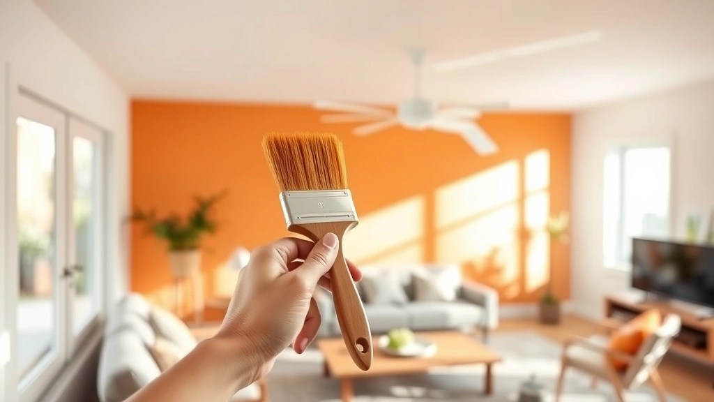
Wall Painting Projects
Before committing to an entire wall, always test your mixed orange on a large sample board and observe it throughout the day. Natural light, artificial light, and even the time of day affect how colors appear. Paint 2-3 large swatches, let them dry completely (important—wet paint looks different than dry), and live with them for a few days. This prevents expensive mistakes.
Furniture Refinishing
Orange can transform tired furniture into statement pieces. Whether you’re painting a dresser, bookshelf, or side table, the same mixing principles apply. For furniture, consider using how to make purple as a complementary accent color to create depth and visual interest. Orange and purple combinations are classic for a reason.
Accent Features
Instead of committing to orange walls, consider using it for smaller features: a painted front door, interior shutters, trim work, or even a single bookshelf. These applications let you enjoy orange’s energy without overwhelming a space. Mixed orange can also be used for stencil work, creating patterns and designs that add personality.
Artistic Projects
Beyond home painting, your orange-mixing skills apply to canvas art, watercolor projects, or mixed media work. The color theory remains constant even as the medium changes. This knowledge makes you a more versatile, confident creator across multiple artistic disciplines.
Troubleshooting Common Mixing Problems
Even experienced DIYers encounter mixing challenges. Here’s how to solve them.
Orange Looks Too Red
If your orange skews too red, you need more yellow. Add yellow in small increments, mixing thoroughly after each addition. Remember that colors shift as paint dries, so test on a sample surface before assuming your mix is wrong.
Orange Looks Too Yellow
Conversely, if your orange is too yellow, add red gradually. This is often the result of using a cool, lemon-toned yellow instead of a warm, golden yellow. For future mixes, consider your yellow’s undertone.
Orange Looks Muddy or Dull
Muddy orange usually results from overmixing or using low-quality paints with weak pigments. Ensure you’re using good quality materials. If your mix still looks dull, try using more saturated reds and yellows. Sometimes starting fresh with better pigments solves the problem entirely.
Orange Doesn’t Match Your Vision
This is usually a lighting issue, not a mixing failure. Orange appears dramatically different under warm versus cool lighting. If your mixed orange doesn’t match your inspiration photo, check what lighting conditions the photo was taken in and try your sample in similar light.
Color Shifts When Paint Dries
This is normal and happens with most paints. Some shift slightly toward red, others toward yellow. Always allow your test samples to dry completely before making final decisions. What looks perfect wet might look slightly off when dry, requiring minor adjustments to your formula.
Frequently Asked Questions
Can I make orange without yellow?
Theoretically, you could create an orange-like hue by mixing red with other colors, but it wouldn’t be true orange. The red-yellow combination is fundamental to orange creation. However, if you’re limited in materials, red mixed with white creates coral, which has orange qualities even without yellow.
What’s the difference between mixing orange and buying orange paint?
Store-bought orange is consistent and convenient, but mixing your own offers customization. You can create shades that don’t exist in commercial palettes, adjust undertones for your specific space, and develop a deeper understanding of color theory. For custom, sophisticated interiors, mixed orange often outperforms off-the-shelf options.
Does the brand of paint matter when mixing orange?
Yes, significantly. Professional-grade paints contain better pigments and produce cleaner, more predictable results than student-grade paints. If you’re mixing custom colors for a visible, important project, investing in quality paints pays dividends in the final result.
Can I mix orange in watercolor the same way as acrylic?
The basic principle is identical—red plus yellow equals orange—but watercolor behaves differently. Watercolor is transparent, so mixed oranges appear more luminous than opaque acrylics. Also, watercolor dries lighter than it appears wet, so account for this shift when mixing.
How do I make orange less warm?
Add a tiny amount of blue to reduce warmth and create a more sophisticated, muted orange. Alternatively, use cooler undertones of red and yellow. A cool red (like alizarin) mixed with cool yellow (like lemon) creates naturally cooler orange than warm versions of these colors.
What’s the best orange for a kitchen accent wall?
This depends on your kitchen’s lighting and style. In naturally lit kitchens, vibrant tangerine energizes the space. In kitchens with artificial lighting, warmer burnt orange or terracotta feels more sophisticated. Always test samples in your specific lighting before committing.
Can I adjust mixed orange if it’s too dark or too light?
Absolutely. If too dark, add white to lighten (creating peach or coral tones). If too light, add more of your original red-yellow mix to increase saturation and depth. This flexibility is one of the major advantages of mixing your own colors.
Related Posts

How Long to Boil Lobster Tails: Cooking Guide

How Long to Fly from New York to London? Travel Times
