
How to Make Green: Expert Guide to Color Mixing
How to Make Green: Expert Guide to Color Mixing for DIY Projects and Home Decor
Green is everywhere in nature, and for good reason—it’s calming, versatile, and works beautifully in almost any design scheme. Whether you’re painting an accent wall, refreshing your garden shed, or tackling a craft project, knowing how to mix green from scratch gives you complete creative control. You’re no longer limited to whatever shades are sitting on the store shelf; you can create custom greens that perfectly match your vision and complement your space.
The magic of mixing green isn’t complicated, but it does require understanding color theory and having the right materials on hand. From creating soft sage tones to vibrant lime hues, the possibilities expand dramatically once you master the fundamentals. This guide walks you through everything you need to know about color mixing, practical techniques, and solutions for common mixing challenges.
Let’s dive into the world of green and unlock your ability to create any shade imaginable for your next home improvement project.
Understanding Color Theory Basics
Before you start mixing, it helps to understand the color wheel and how colors interact. The color wheel is your roadmap to successful mixing. Primary colors—red, yellow, and blue—cannot be created by mixing other colors together. Secondary colors, however, are made by combining two primary colors in equal parts. Green is a secondary color, which means it’s created by combining two of the primary colors.
The key to mastering color mixing is understanding that not all blues are created equal, and not all yellows behave the same way. A warm yellow mixed with a cool blue will produce different results than a cool yellow paired with a warm blue. This is where things get interesting and where your experiments become valuable learning experiences.
Complementary colors sit opposite each other on the color wheel. For green, the complement is red. This matters because adding even small amounts of red to your green mixture will shift it toward brown or neutralize the vibrancy. Understanding these relationships helps you predict and control your results.
Color saturation and value (lightness or darkness) are equally important. A saturated green is bold and vivid, while a desaturated green is muted and sophisticated. By adding white, black, or complementary colors, you can adjust these qualities to match any design aesthetic.
The Primary Ingredients: Blue and Yellow
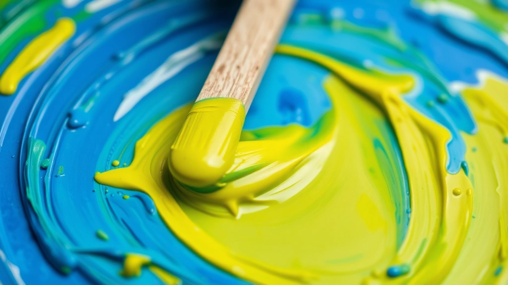
To create green, you need blue and yellow. Simple enough, right? The challenge is that these two primary colors come in many varieties, and choosing the right ones dramatically affects your final result.
Yellow Types: Warm yellows lean toward orange, while cool yellows lean toward green. A lemon yellow (cool) mixed with any blue will give you a cleaner, brighter green. A golden yellow (warm) mixed with blue creates earthier, olive-toned greens. For your first experiments, start with a basic primary yellow—the kind you learned with in elementary school art class.
Blue Types: Ultramarine blue is warm and leans slightly purple. Cerulean blue is cool and leans slightly green. Prussian blue is very intense and cool. When mixing green, ultramarine blue tends to produce greens with more depth, while cerulean creates brighter, more vibrant results. If you’re starting out, keep things simple with a standard primary blue.
The ratio of blue to yellow matters enormously. Equal parts create a balanced, true green. More yellow produces yellow-green or lime tones. More blue produces blue-green or teal shades. Start with a 1:1 ratio and adjust from there based on your desired result.
If you’re working with how to make blue from other colors (which is rare since blue is primary, but helpful for understanding color mixing), you’d need red and yellow. Similarly, understanding how to make yellow isn’t necessary since it’s primary, but grasping color relationships helps you mix better greens. You might also explore how to make purple to deepen your overall color mixing knowledge.
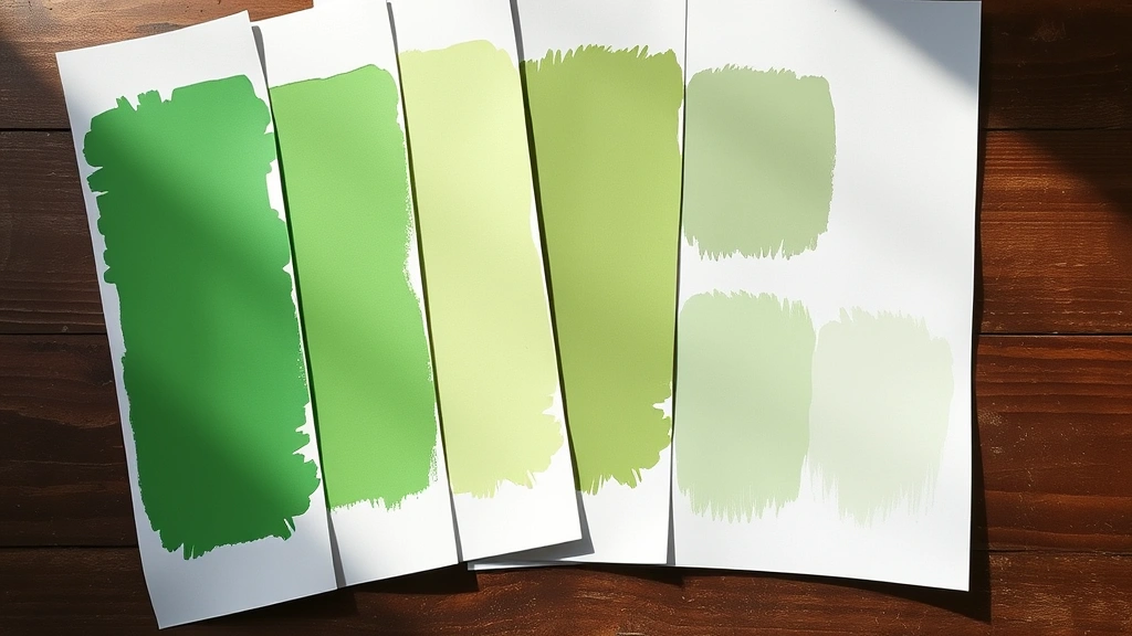
Creating Different Shades of Green
Once you’ve mastered basic green mixing, the real fun begins. Different shades of green serve different purposes in home design and DIY projects.
Lime Green: This bright, energetic green requires more yellow than blue. Use a 2:1 or even 3:1 yellow-to-blue ratio. Lime green works beautifully in modern spaces, children’s rooms, or as an accent color in creative projects. It’s bold and demands attention.
Forest Green: This deep, sophisticated shade needs more blue than yellow, typically a 1:2 blue-to-yellow ratio. Add a touch of black or dark brown to deepen it further. Forest green is timeless for traditional decor, feature walls, or exterior trim.
Sage Green: This muted, calming green is created by mixing green with white and a tiny hint of gray or brown. Start with your balanced green (equal blue and yellow), then gradually add white until you reach the desired lightness. This shade has exploded in popularity for modern farmhouse and contemporary designs.
Teal/Blue-Green: Increase your blue significantly—use a 1:3 or 1:4 blue-to-yellow ratio. Teal sits between blue and green on the color wheel and creates a sophisticated, slightly cool appearance. It’s excellent for bathrooms and coastal-inspired spaces.
Olive Green: Mix your base green, then add a small amount of red or brown. This creates an earthy, vintage-inspired green that’s incredibly versatile. Olive works well in traditional, bohemian, and eclectic interiors.
Mint Green: Start with your base green, then add white to lighten it significantly. A touch of blue can enhance the minty quality. Mint is fresh and energetic without being as aggressive as lime green.
Paint Mixing Techniques and Tools
Having the right tools makes mixing easier and more consistent. You don’t need expensive equipment—many household items work perfectly.
Essential Tools: A palette (ceramic plates, glass, or even a white ceramic tile work great), mixing sticks or old spoons, containers for storing your mixed colors, and something to measure with—whether that’s teaspoons, measuring cups, or even a dropper for precise ratios.
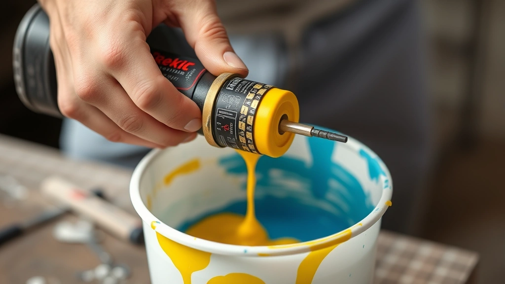
Mixing Process: Start with your base color (usually the color you need more of) and add the second color gradually. It’s far easier to add more of a color than to remove it. Mix thoroughly, ensuring no streaks or unmixed sections remain. For large quantities, use a paint stirrer or whisk attachment on a drill—this ensures even distribution and saves your arm from fatigue.
For acrylic paints, mix on a non-porous surface. For oils, use a palette knife and work on a proper artist’s palette. Watercolors are mixed similarly but require adding water to achieve the desired transparency and intensity.
Storage Tips: If you’ve created a green you absolutely love, store it properly. Airtight containers prevent drying and oxidation. Label everything with the date and color ratios used. This becomes your personal color recipe book for future projects. Many DIYers keep a small sample on white paper or card stock to reference later.
According to Family Handyman’s comprehensive painting guide, proper mixing technique is just as important as quality paint. Taking time to mix thoroughly prevents color inconsistencies across your project.
Working with Different Paint Types
The mixing principles remain consistent, but application varies depending on your paint medium.
Acrylic Paint: This water-based paint is forgiving and perfect for beginners. It dries quickly, which means you can test your mixed color on your project surface and adjust if needed. Acrylics are ideal for furniture refinishing, craft projects, and interior walls. The mixing ratio approach works perfectly—just remember that acrylics may dry slightly darker than they appear when wet.
Oil Paint: Oil-based paints offer richer colors and longer working time. Mixing ratios are the same, but you’ll use mineral spirits or linseed oil as your medium rather than water. Oils are excellent for exterior trim, fine art projects, and achieving a luxurious finish. They require more cleanup and proper ventilation.
Latex Paint: Standard house paint is water-based like acrylics but formulated for walls and larger surfaces. You can mix latex paint using the same principles, though most people purchase pre-mixed colors from paint stores. If you’re mixing custom colors for walls, work in larger quantities and ensure thorough mixing with a power drill and mixing paddle.
When selecting paint for your project, check the manufacturer’s recommendations. Home Depot’s paint selection guide provides detailed information about paint types and their best uses.
Watercolor: These transparent paints mix beautifully and are perfect for art projects and illustrations. The same blue-plus-yellow-equals-green principle applies, but you’ll control intensity by adjusting water content. More water creates lighter, more transparent greens; less water creates deeper, more saturated colors.
Testing and Adjusting Your Greens
Before committing your carefully mixed green to your entire project, always test it. This simple step prevents disappointment and wasted materials.
Test Surfaces: Create samples on white poster board, cardboard, or even the actual surface you’re planning to paint (in an inconspicuous area). Paint a generous swatch and let it dry completely. Wet paint looks different from dry paint—sometimes dramatically so. Colors appear darker when wet and may shift slightly as they cure.
Lighting Matters: View your test swatch in natural daylight, artificial indoor lighting, and the specific lighting conditions of your space. The same green can look completely different under LED versus incandescent bulbs, or in bright morning light versus dim evening light. This is especially important for feature walls and visible surfaces.
Adjusting Your Mix: If your green is too yellow, add more blue. If it’s too blue, add more yellow. If it’s too bright, add white to lighten or a tiny amount of the complementary color (red) to mute it. If it’s too dull, add a touch of white or increase the saturation of your base colors. Make small adjustments—you can always add more, but removing color is impossible.
Keep detailed notes during this process. Write down the exact amounts of blue and yellow you used, any additional colors added, and how the final result looks. This documentation becomes invaluable when you need to remix the same color for touch-ups or future projects.
Common Mixing Mistakes to Avoid
Even experienced DIYers fall into these traps. Knowing what to avoid saves time, money, and frustration.
Using Muddy Colors: If your base blue or yellow is already muted or muddy, your resulting green will be too. Always start with vibrant, saturated primary colors for the brightest results. If you want a muted green, it’s better to start with bright colors and tone them down deliberately.
Inconsistent Mixing: Partially mixed colors create streaky, uneven results. Mix thoroughly until no color variations remain. For large quantities, use mechanical mixing. For small amounts, spend extra time with your mixing stick or palette knife.
Wrong Ratios for Your Goal: Remember that more yellow creates yellow-green, more blue creates blue-green, and equal parts create true green. If you’re aiming for a specific shade and your result looks off, check your ratio first.
Adding Too Much White Too Quickly: White is powerful. Adding it gradually gives you better control over lightness. A little white goes a long way—you can always add more, but diluting your color back to full saturation is difficult.
Ignoring Surface Preparation: Your perfectly mixed green looks terrible on a dirty, poorly prepared surface. Clean walls thoroughly, sand rough spots, and prime if necessary. This Old House’s wall painting guide covers essential preparation steps that make a real difference.
Forgetting About Color Temperature: A warm green and a cool green serve different purposes. Warm greens (with more yellow) feel inviting and energetic. Cool greens (with more blue) feel calm and sophisticated. Choose based on the mood you want to create in your space.
Many professionals recommend keeping a color mixing journal. Document every batch you create—the date, the colors used, the ratios, and the final appearance. Over time, this becomes an invaluable reference for recreating favorite shades and avoiding repeated mistakes.
If you’re working on outdoor projects, consider that exterior paint colors need special consideration for durability and UV resistance. Some greens fade faster than others when exposed to direct sunlight.
For those interested in bringing green into their spaces beyond paint, understanding plant care enriches your overall design. If you’re creating a green accent wall and want to complement it with living plants, learning to how to propagate pothos gives you free, continuous greenery. Similarly, if you’re designing an outdoor green space, knowing how to grow garlic and how to grow onions helps create a productive garden with natural green elements.
Frequently Asked Questions
Can I make green without blue paint?
Technically, you can create a green-ish color by mixing yellow with other colors, but true green requires blue. If you don’t have blue paint, you could theoretically create blue from red and yellow (though this is inefficient and rarely done), but the simplest solution is to purchase blue paint. For most DIY projects, having primary colors on hand is worth the minimal investment.
Why does my homemade green look different from store-bought green?
Store-bought greens are formulated with specific pigments and additives that create consistent, predictable colors. Your homemade green depends on the exact pigments in your blue and yellow, the ratio you use, and lighting conditions. This isn’t a problem—it’s actually an advantage because you create custom colors unavailable in stores. If you want your homemade green to match a specific store color, test and adjust until you get as close as possible.
How much white should I add to create a lighter green?
There’s no universal answer—it depends on how light you want the final color and how saturated your base green is. Start by adding white in small increments (about 10-20% of your base green volume) and mix thoroughly. Keep adding until you reach your desired lightness. Remember that white can make colors look chalky or flat if overused, so use it sparingly.
Is it better to mix green paint or buy it pre-mixed?
For walls and large projects, pre-mixed paint from a paint store is often more practical and consistent. For custom shades, artistic projects, furniture refinishing, and when you need a specific green that matches your vision, mixing your own is better. Many DIYers do both—buying basic greens for walls while mixing custom shades for accent pieces and creative projects.
What if I accidentally add too much blue to my green?
You’ve created a blue-green or teal. If this isn’t your desired result, add more yellow to shift it back toward true green. If you’ve added way too much blue, you may need to start over, but small adjustments are usually fixable. This is why adding colors gradually is so important.
Can I mix green using digital color tools?
Digital tools can help you visualize color combinations and understand color theory, but actual paint mixing requires physical experimentation. RGB colors on screens don’t translate directly to physical paint pigments. Use digital tools for inspiration and planning, then test your ideas with actual paint samples.
How do I store leftover mixed green paint?
Use airtight containers—mason jars, plastic paint containers, or even sealed plastic bags work. Store in a cool, dark place away from extreme temperatures. Label with the date and color recipe. Acrylic and latex paints typically last several months to a year when properly stored. Oil paints last longer. Before using stored paint, stir thoroughly to recombine any settled pigments.
Related Posts

How Long to Boil Lobster Tails: Cooking Guide

How Long to Fly from New York to London? Travel Times
