How to Find Relative Frequency: Expert Guide

How to Find Relative Frequency: Expert Guide
Whether you’re analyzing survey data, tracking home improvement project outcomes, or simply curious about the math behind everyday statistics, understanding relative frequency is incredibly useful. It’s one of those concepts that sounds more intimidating than it actually is—once you grasp the fundamentals, you’ll find yourself spotting opportunities to use it everywhere.
Relative frequency transforms raw data into meaningful percentages and proportions. Instead of just knowing that 15 people prefer blue paint for their living rooms, relative frequency tells you that represents 37.5% of your survey respondents. That shift in perspective makes data genuinely actionable and easier to compare across different datasets.
This comprehensive guide walks you through everything you need to know about finding relative frequency, from basic calculations to real-world applications. We’ll break down the math, show you practical examples, and give you the confidence to tackle frequency problems on your own.
What is Relative Frequency?
Relative frequency is the proportion of times a particular value appears in a dataset, expressed as a fraction, decimal, or percentage. Think of it as the answer to the question: “Out of everything we measured, how often did this specific thing happen?”
The key difference between frequency and relative frequency matters more than you might think. Frequency is simply the count—how many times something occurred. Relative frequency puts that count into perspective by showing what portion of the total it represents. If you surveyed 100 homeowners and 25 said they’d renovated their kitchens, the frequency is 25. The relative frequency is 25/100, or 0.25, or 25%.
This distinction becomes powerful when comparing datasets of different sizes. You can easily see that 25 out of 100 (25%) is proportionally equivalent to 50 out of 200 (also 25%), even though the raw counts differ. That’s the magic of relative frequency—it standardizes your data.
Understanding relative frequency helps you make sense of survey results, quality control data, experimental outcomes, and statistical analyses. It’s fundamental to probability, data science, and any field where you need to understand patterns in numbers.
The Basic Formula
The formula for relative frequency is elegantly simple:
Relative Frequency = Frequency of a Value / Total Number of Observations
Or in more mathematical notation: RF = f / n, where f represents the frequency of a specific value and n represents the total number of observations in your dataset.
Let’s break this down with concrete numbers. Imagine you’re tracking how many DIY home improvement projects your neighborhood completed last year. If your area had 200 total projects and 48 of them were kitchen renovations, the relative frequency of kitchen renovations would be 48/200 = 0.24 or 24%.
The result can be expressed three ways, and you’ll use whichever makes most sense for your context:
- As a fraction: 48/200 (which simplifies to 6/25)
- As a decimal: 0.24
- As a percentage: 24%
All three representations are mathematically equivalent. Percentages tend to be the most intuitive for most people, but scientists and statisticians often prefer decimals for calculations.
Here’s something important: all relative frequencies for a complete dataset must add up to 1 (if expressed as decimals) or 100% (if expressed as percentages). This serves as a helpful check on your work. If your relative frequencies don’t total to 1 or 100%, you’ve made an error somewhere.
Step-by-Step Calculation Process
Let’s walk through the actual process of calculating relative frequency with a detailed example. We’ll use a scenario involving paint color preferences from a home improvement survey.
Step 1: Gather Your Data
First, collect all your raw data and organize it clearly. In our example, you surveyed 80 homeowners about their preferred interior paint color:
- Neutral tones: 32 people
- Blue shades: 24 people
- Green shades: 16 people
- Other colors: 8 people
Step 2: Verify Your Total Count
Add up all frequencies to ensure they equal your total observations: 32 + 24 + 16 + 8 = 80. Perfect.
Step 3: Divide Each Frequency by the Total
Now calculate the relative frequency for each category:
- Neutral tones: 32 ÷ 80 = 0.40
- Blue shades: 24 ÷ 80 = 0.30
- Green shades: 16 ÷ 80 = 0.20
- Other colors: 8 ÷ 80 = 0.10
Step 4: Convert to Your Preferred Format
If percentages work better for your audience, multiply each decimal by 100:
- Neutral tones: 0.40 × 100 = 40%
- Blue shades: 0.30 × 100 = 30%
- Green shades: 0.20 × 100 = 20%
- Other colors: 0.10 × 100 = 10%
Step 5: Verify Your Work
Check that all relative frequencies sum to 1 (or 100%): 0.40 + 0.30 + 0.20 + 0.10 = 1.00 ✓
This verification step catches errors before they propagate through your analysis. It only takes a few seconds but saves considerable frustration later.

Practical Examples You Can Follow
Understanding the concept is one thing; seeing it applied to realistic situations solidifies your knowledge. Here are several scenarios where you might need to calculate relative frequency.
Example 1: Home Renovation Project Types
A contractor tracked 150 projects completed over a year:
- Bathroom remodels: 45 projects
- Kitchen upgrades: 60 projects
- Flooring work: 30 projects
- Painting: 15 projects
The relative frequencies are:
- Bathroom remodels: 45/150 = 0.30 (30%)
- Kitchen upgrades: 60/150 = 0.40 (40%)
- Flooring work: 30/150 = 0.20 (20%)
- Painting: 15/150 = 0.10 (10%)
This tells the contractor that kitchen work represents the largest portion of their business, followed by bathroom remodels. This insight could influence marketing strategy or staffing decisions.
Example 2: Quality Control in Materials
A lumber supplier inspected 500 boards and found defects in the following categories:
- No defects: 475 boards
- Minor defects: 20 boards
- Major defects: 5 boards
The relative frequencies show:
- No defects: 475/500 = 0.95 (95%)
- Minor defects: 20/500 = 0.04 (4%)
- Major defects: 5/500 = 0.01 (1%)
The 95% success rate indicates strong quality control, but that 4% minor defect rate might be worth investigating further.
Example 3: Survey Response Distribution
You asked 200 people: “How often do you tackle DIY home projects?” The responses were:
- Weekly: 30 people
- Monthly: 70 people
- Quarterly: 60 people
- Rarely: 40 people
Relative frequencies:
- Weekly: 30/200 = 0.15 (15%)
- Monthly: 70/200 = 0.35 (35%)
- Quarterly: 60/200 = 0.30 (30%)
- Rarely: 40/200 = 0.20 (20%)
This data reveals that 80% of respondents tackle projects at least quarterly, which suggests a fairly engaged DIY community.
Creating Frequency Tables
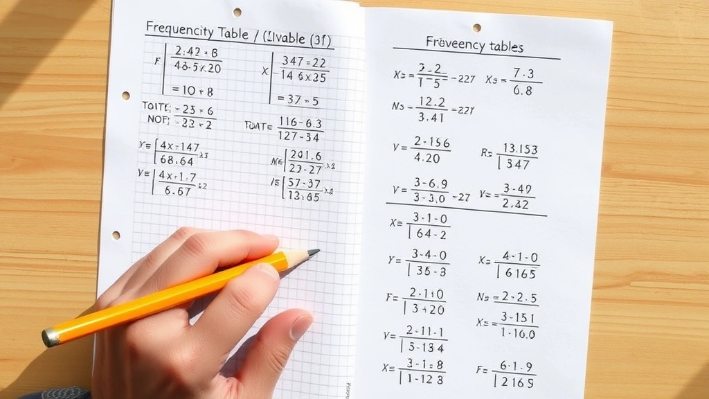
Organizing your calculations in a frequency table makes everything clearer and easier to present. A well-constructed table shows frequencies, relative frequencies, and often percentages all at once.
Here’s what a professional frequency table looks like:
Paint Color Preference Survey Results (N = 80)
| Color Category | Frequency (f) | Relative Frequency | Percentage |
|---|---|---|---|
| Neutral Tones | 32 | 0.40 | 40% |
| Blue Shades | 24 | 0.30 | 30% |
| Green Shades | 16 | 0.20 | 20% |
| Other Colors | 8 | 0.10 | 10% |
| Total | 80 | 1.00 | 100% |
Notice how the total row shows that all frequencies sum to 80, all relative frequencies sum to 1.00, and all percentages sum to 100%. This format makes it immediately obvious if something’s wrong with your calculations.
When creating your own frequency table, follow these conventions:
- Label the total number of observations (N) somewhere visible
- Include both the raw frequency and relative frequency columns
- Always include a total row
- Use consistent decimal places (usually two for relative frequencies)
- Consider adding a percentage column for clarity
Frequency tables work beautifully with different types of data—categorical (like paint colors), numerical (like ages), or ordinal (like satisfaction levels). The calculation method remains identical regardless of your data type.

Common Mistakes to Avoid
Even straightforward calculations can go wrong if you’re not careful. Here are the errors people make most frequently when calculating relative frequency.
Mistake 1: Using the Wrong Total
The most common error is dividing by an incorrect total. Make sure you’re using the sum of all frequencies, not just a subset. If you’re analyzing paint preferences and accidentally only count 75 responses instead of 80, every relative frequency will be slightly too high.
Mistake 2: Forgetting to Account for All Data
Missing categories or responses throw off your calculations. If someone surveyed paint colors and forgot to include “White/Off-White” as a category, they’d be missing potentially significant data. Always verify that your frequencies account for every observation.
Mistake 3: Inconsistent Decimal Places
When you need to multiply fractions or work with decimals, rounding inconsistently creates confusion. Pick a decimal precision (usually two places for percentages, three for decimals) and stick with it throughout your work.
Mistake 4: Confusing Relative Frequency with Cumulative Frequency
These are different concepts. Relative frequency shows the proportion for each individual category. Cumulative frequency adds up frequencies as you go down the list. They serve different purposes, so don’t mix them up.
Mistake 5: Forgetting the Verification Step
Always check that your relative frequencies sum to 1.00 (or 100%). This simple verification catches most errors before they become problems. It takes 10 seconds and prevents embarrassing mistakes in reports or presentations.
Mistake 6: Not Rounding Appropriately
If your relative frequencies don’t sum to exactly 1.00 or 100% due to rounding, that’s usually fine—mention this in your work. However, if they’re significantly off (like 0.98 or 1.02), you’ve made a calculation error.
Real-World Applications
Relative frequency isn’t just an academic exercise—it shows up constantly in practical situations.
Home Improvement Industry
Contractors and suppliers use relative frequency to understand market trends. If a lumber company finds that 35% of orders include composite decking (compared to 25% five years ago), they can adjust inventory and marketing accordingly. This is also useful when tracking the range of project values or timelines across multiple jobs.
Quality Control and Manufacturing
Manufacturers track defect rates using relative frequency. A factory producing cabinet hardware might find that 2% of units have finish defects. By monitoring this percentage over time, they can spot quality issues early and take corrective action before they affect customer satisfaction.
Market Research and Surveys
When brands survey consumer preferences, they rely heavily on relative frequency. Understanding that 42% of respondents prefer modern design, 38% prefer traditional, and 20% prefer transitional helps companies develop products that match market demand.
Healthcare and Safety
Hospitals track medication error rates, infection rates, and adverse event frequencies as percentages of total cases. These relative frequencies help identify systemic problems and measure improvement efforts over time.
Environmental and Climate Data
Scientists use relative frequency to analyze precipitation patterns, temperature distributions, and species occurrence rates. This helps predict future trends and understand environmental changes.
Sports and Performance Analytics
Teams track statistics like shooting percentages (successful shots relative to attempts) and win rates against specific opponents. These relative frequencies inform strategy and player evaluation.
Customer Service and Satisfaction
Businesses analyze complaint categories, resolution times, and satisfaction ratings as relative frequencies. If 15% of complaints are about delivery time and 8% about product quality, the company knows where to focus improvement efforts.
Frequently Asked Questions
What’s the difference between frequency and relative frequency?
Frequency is the raw count of how many times something occurs. Relative frequency expresses that count as a proportion of the total. If 25 out of 100 survey respondents prefer blue paint, the frequency is 25 and the relative frequency is 0.25 or 25%. Relative frequency makes it easy to compare datasets of different sizes.
Can relative frequency be greater than 1?
No. Since relative frequency represents a part of the whole, it can never exceed 1 (or 100% if expressed as a percentage). If your calculations show a relative frequency greater than 1, you’ve made an error—likely using the wrong total in your division.
How is relative frequency used in probability?
Relative frequency is a practical way to estimate probability. If you observe an event occurring with a relative frequency of 0.30, you can estimate the probability of that event at 30%. This empirical approach to probability is especially useful when theoretical calculations are difficult.
What’s the difference between relative frequency and relative frequency distribution?
A relative frequency is a single calculation for one category. A relative frequency distribution shows the relative frequencies for all categories in a dataset, usually organized in a table. The distribution gives the complete picture of how your data is spread across all categories.
Do relative frequencies always have to sum to exactly 1.00?
In theory, yes. In practice, rounding can cause them to sum to 0.99 or 1.01. This is acceptable and expected. However, if they sum to something like 0.95 or 1.05, you’ve likely made a calculation error or forgot to include some data.
How do I present relative frequency data effectively?
Use a frequency table with columns for category, frequency, relative frequency, and percentage. Alternatively, create a pie chart (for percentages), bar graph, or histogram depending on your data type. Khan Academy offers excellent resources on data visualization.
Can you calculate relative frequency for continuous data?
Yes, but you typically group continuous data into intervals first (like age ranges from 20-30, 30-40, etc.), then calculate relative frequency for each interval. This approach works well for things like tracking home improvement costs or project timelines.
What tools can help me calculate relative frequency?
Spreadsheet programs like Excel or Google Sheets make calculations easy with simple formulas. Dummies offers a helpful guide on using Excel for frequency calculations. For larger datasets or more complex analysis, statistical software like R or Python works well.
Is relative frequency the same as percentage?
Relative frequency expressed as a decimal (like 0.35) and as a percentage (like 35%) are mathematically equivalent—just different representations. Percentages are often more intuitive for general audiences, while decimals are preferred in statistical calculations.
Now you understand how to find relative frequency. Start with your data, divide each category’s frequency by the total, and verify that everything sums correctly. Whether you’re analyzing home improvement trends, managing quality control, or interpreting survey results, this fundamental skill will serve you well. The process is straightforward once you grasp the concept, and the insights you gain from relative frequency analysis are genuinely valuable for decision-making.
For additional learning, check out Statistics How To’s comprehensive guide on relative frequency or explore Home Depot’s project guides for practical applications in home improvement contexts.


