
How to Make Green: Color Mixing Guide
How to Make Green: The Ultimate Color Mixing Guide
Green is everywhere in nature, and it’s one of the most versatile colors you can create in your DIY projects. Whether you’re painting a accent wall, mixing custom paint for furniture restoration, or working on an art project, knowing how to make green opens up endless creative possibilities. The beautiful part? You don’t need to buy every shade of green under the sun—with the right base colors and a little mixing know-how, you can create virtually any green tone your project demands.
The magic of color mixing lies in understanding the relationship between primary and secondary colors. Green isn’t a primary color in traditional art (that honor goes to red, yellow, and blue), but it’s remarkably easy to create once you grasp the fundamentals. This guide will walk you through everything from basic green mixing to achieving those sophisticated sage, forest, and lime variations that can transform your space.
Before we dive into the nitty-gritty of pigment combinations, let’s establish what you’re working with. Having quality materials makes all the difference between muddy, disappointing greens and vibrant, professional-looking results. Whether you’re mixing acrylics for a canvas, oils for a restoration project, or gouache for decorative work, the principles remain the same—but the execution varies slightly depending on your medium.
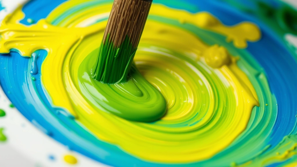
The Basic Formula: Blue + Yellow = Green
At its core, creating green is refreshingly straightforward. The fundamental equation is simple: blue and yellow combine to create green. This is the foundation of color theory that has guided artists and designers for centuries. When you mix equal parts of a true blue with a true yellow, you’ll get a balanced, neutral green that works as an excellent starting point for nearly any project.
The ratio matters more than you might think. If you want a green that leans slightly toward the blue side (often called a cooler green), add more blue to your mixture. Conversely, if you prefer a warmer, more yellow-tinged green, increase the yellow proportion. Start with small amounts and adjust gradually—it’s much easier to add more color than to remove it once you’ve gone too far.
The type of blue and yellow you choose dramatically affects your final green. A bright lemon yellow mixed with a sky blue creates a completely different result than a golden ochre yellow mixed with a navy blue. This is why many DIY enthusiasts keep multiple shades of primary colors on hand. Understanding the undertones of your base colors gives you incredible control over your final product.
Understanding Primary Colors in Mixing
Primary colors are the building blocks of all color mixing. In traditional art, the primary colors are red, yellow, and blue—though modern color theory sometimes recognizes cyan, magenta, and yellow as alternatives. For creating green, you’re primarily concerned with blue and yellow, but understanding how how to make blue and how to make yellow expands your options considerably.
Each primary color has temperature characteristics. Warm yellows have red undertones, while cool yellows lean toward green. Similarly, warm blues contain hints of red (sometimes called ultramarine), while cool blues skew toward cyan. When mixing, these undertones interact, which is why two different greens made from different blue-yellow combinations can look surprisingly different.
If you’re working with limited supplies, you might find yourself needing to create blue or yellow from other colors. Learning these relationships helps you troubleshoot when you don’t have the exact shade available. For instance, if you’re out of blue but have red and yellow, you could theoretically create blue-ish tones by understanding color relationships, though the results won’t be ideal compared to using actual blue pigment.
Secondary colors, like green, are created by mixing two primary colors together. Green holds a special place in the color wheel because it’s the bridge between blue and yellow. This positioning makes green incredibly useful in design—it naturally harmonizes with both warm and cool color schemes depending on which direction your particular shade leans.
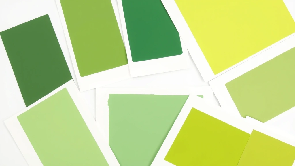
Creating Different Green Variations
Once you’ve mastered basic green, the real fun begins. The color spectrum offers hundreds of green possibilities, from pale sage to deep forest, from bright lime to muted olive. Each variation serves different design purposes and creates distinct moods in your space.
Lime Green and Bright Greens: If you want vibrant, energetic green tones, start with your base green and add extra yellow. The more yellow you incorporate, the brighter and more acidic the green becomes. Lime green works wonderfully for accent walls or modern furniture pieces where you want visual impact. Add white to create softer versions—mint green is essentially lime green with significant white added.
Forest and Deep Greens: To achieve darker, more sophisticated greens, add blue to your base mixture, then introduce small amounts of black or dark brown. Forest green evokes nature and works beautifully in traditional or transitional interiors. These darker greens feel grounded and timeless—perfect for creating focal points without overwhelming a space.
Sage and Muted Greens: The trendy sage green everyone loves starts with a basic green, then gets toned down with white and a touch of gray or brown. These sophisticated, dusty greens work in nearly any design scheme because they’re naturally calming. To achieve sage, mix your base green with white and a tiny bit of black or umber—the black creates gray, which neutralizes and softens the green’s intensity.
Olive Green: Olive is essentially yellow-green with brown added. Start with a yellow-leaning green (more yellow in your blue-yellow mix), then gradually introduce brown or burnt sienna. Olive green carries warm, earthy undertones that feel natural and sophisticated. It’s particularly effective in farmhouse or rustic design schemes.
Teal and Blue-Greens: If you’re feeling adventurous, experiment with more blue than yellow in your base mixture. The result skews toward teal or cyan—colors that feel contemporary and calming. These blue-greens work exceptionally well in bathrooms or bedrooms where you want a spa-like atmosphere.
Green Mixing Across Different Paint Types
The principles of color mixing remain consistent, but execution varies depending on your medium. Understanding these differences ensures professional results whether you’re working with acrylics, oils, watercolors, or house paint.
Acrylic Paint: Acrylics are forgiving and quick-drying, making them ideal for experimentation. Mix colors on a palette using a brush or palette knife. Acrylics dry darker than they appear wet, so your mixed green might look slightly different once fully cured. Always test your mixture on a scrap surface before committing to your project. Acrylic paint is water-soluble, so cleanup is simple with just soap and water.
Oil Paint: Oil paints offer rich, luminous colors and blend beautifully. Mix on a palette with a palette knife or brush, using paint thinner if needed to adjust consistency. Oils dry slowly, giving you extended working time to refine your color. However, they require solvents for cleanup and proper ventilation during use. The slow drying time means your mixed green will look essentially the same wet and dry, making color matching more predictable.
Watercolor: Watercolor mixing happens directly on wet paper or on a palette. Use less water for more saturated greens, more water for lighter tints. Watercolors are transparent, so layering colors creates depth and complexity. This transparency means your green will appear different depending on what’s underneath—a green over yellow will look different than green over blue.
House Paint: If you’re mixing large quantities for wall painting, work with either latex (water-based) or oil-based house paint. Most paint stores can custom-mix colors, but if you’re doing it yourself, use a paint stirrer and mix thoroughly. House paint requires more pigment to achieve color changes compared to artist paints, so expect to use larger quantities of colorant. Always mix more than you think you’ll need—matching a custom color later is frustratingly difficult.
Advanced Mixing Techniques for Custom Greens
Once you’ve mastered basic green mixing, advanced techniques let you create nuanced, sophisticated colors that elevate your projects from good to gallery-worthy.
Undertone Adjustment: Every color has subtle undertones that affect how it interacts with surrounding colors and light. To create a green with warm undertones, add tiny amounts of red or brown. To create cool-toned greens with blue undertones, add touches of blue or purple. These adjustments are subtle—a little goes a long way. Start with drops rather than brushfuls.
Neutralizing with Complements: The complement of green on the color wheel is red or magenta. Adding tiny amounts of red to green creates muted, sophisticated tones. This technique is particularly useful when you’ve mixed a green that’s too bright or artificial-looking. A touch of red brings it back to reality without completely changing the color.
Layering for Depth: Instead of mixing all your color at once, try applying thin layers of different greens. A base coat of yellow-green topped with a layer of blue-green creates visual interest and depth that a single mixed color can’t achieve. This technique works beautifully in watercolor and glazing techniques.
Desaturation Techniques: If your green is too intense, desaturate it by adding gray (black + white), brown, or the complementary color in tiny amounts. Desaturation makes colors feel more natural and sophisticated. This is how designers create those expensive-looking muted greens that appear in high-end interiors.
Common Mistakes to Avoid
Even experienced makers sometimes stumble with color mixing. Learning from common pitfalls saves time, money, and frustration.
Using Muddy Colors: When you mix too many colors together, you create mud. Stick to two or three colors maximum for clean, vibrant results. If your green looks brownish or gray, you’ve likely added too many colors or too much black.
Ignoring Pigment Quality: Cheap paints contain less pigment and more filler, making them harder to mix into desired colors. Investing in quality primary colors pays dividends in your final results. Student-grade paints work for practice, but professional-grade gives superior results.
Not Testing First: Always test your mixed color on a sample surface before committing to your entire project. Paint colors look different on different surfaces and under different lighting conditions. What looks perfect on your palette might look completely different on your wall.
Forgetting About Drying Time: Acrylic and watercolor dry darker, while oils dry approximately the same shade they appear wet. If you’re mixing for a specific result, account for how your medium dries. This is why testing is crucial.
Mixing Without Measuring: If you might need to remix the same green later, write down your proportions. “A bit of blue and a bit more yellow” doesn’t translate well to future batches. Use measuring spoons or note ratios like “3 parts yellow to 2 parts blue.”
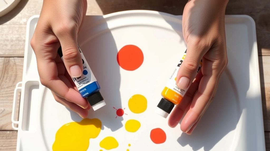
Essential Tools and Materials
Having the right equipment makes color mixing significantly easier and more successful. You don’t need expensive supplies, but quality basics matter.
Palette: Any non-porous surface works—ceramic palettes, glass plates, or even white ceramic tiles. Avoid absorbent surfaces like paper or wood, which absorb paint and affect color mixing.
Mixing Tools: Palette knives (for thick paints like oils and acrylics) or brushes work for mixing. Use separate tools for different colors to avoid contamination. A simple plastic palette knife costs mere dollars but saves endless frustration.
Primary Colors: Invest in quality yellow, blue, and red. Add white and black for tints and shades. These five colors create almost any color you’ll need. Some artists prefer having multiple shades of primary colors (warm and cool versions of each) for maximum control.
Testing Surfaces: Keep scrap paper, cardboard, or old boards handy for testing mixed colors. Testing prevents costly mistakes on your actual project.
Lighting: Color perception changes dramatically under different lighting. Mix and test colors under the same lighting conditions where your finished project will live. Natural daylight, LED, and incandescent bulbs all render colors differently.
If you’re working with specialty projects like how to make slime without glue, you might need additional materials like food coloring or acrylic paint mixed into your slime base. The color-mixing principles remain similar, though the medium behaves differently.
Frequently Asked Questions
What’s the difference between mixing green with acrylics versus oils?
The fundamental color theory is identical, but acrylics dry faster and darker, while oils dry slowly and maintain their wet appearance. Acrylics are water-soluble and require water for cleanup, while oils need solvents. For color matching, oils are more predictable since they don’t change shade as they dry. Both produce beautiful greens—choose based on your project needs and experience level.
Can I make green without blue paint?
Technically, you could create blue-ish tones by mixing other colors, but the results won’t be true green. The most straightforward approach is obtaining actual blue paint. However, if you’re limited on supplies and need green urgently, mixing red and yellow creates orange, which when mixed with more yellow creates yellow-green tones. It’s not ideal, but it’s a workaround in emergencies.
Why does my homemade green look muddy?
Muddy greens typically result from mixing too many colors together or using low-quality paints with less pigment. Stick to just blue and yellow for clean greens. If your green still looks muddy, try using different shades of blue and yellow—sometimes the specific pigments matter more than the proportions. Also, adding black instead of dark colors creates muddy tones; use dark blue or dark brown instead.
How do I make my green lighter without losing the color?
Add white to lighten green while maintaining its hue. Start with small amounts of white and mix thoroughly—white is powerful and a little goes a long way. If you add too much white, your green becomes pale and washed out. The goal is finding the balance between light and saturated. For very light greens, you might need 3-4 parts white to 1 part green mixture.
What if I want a green that matches nature exactly?
Nature’s greens are incredibly varied—different plants, lighting conditions, and seasons create endless green variations. Study the specific green you’re trying to match. Is it more yellow-green like fresh spring leaves? More blue-green like evergreens? More muted like dried foliage? Identify the dominant undertone, then mix accordingly. Photography of your inspiration helps tremendously for accurate matching.
Can I mix green from red, yellow, and blue?
Yes, but not directly. Red and yellow create orange, not green. However, if you mix red and blue first, you get purple. Then mixing that purple with yellow creates muted, brownish greens. It’s overcomplicated compared to simply mixing blue and yellow directly. Stick with the direct blue-yellow method for best results.
How much does color mixing skill improve with practice?
Dramatically. Your first attempts might produce unexpected results, but after mixing 10-15 batches, intuition develops. You start understanding how different blues and yellows behave, how much white is needed for specific tints, and how complements affect vibrancy. Keep a color journal documenting your ratios and results—it becomes an invaluable reference.
Is there a difference between making green for walls versus canvas?
The mixing process is identical, but the application differs. Wall paint requires larger quantities and needs to be thoroughly mixed to ensure consistency across the entire wall. Canvas work uses smaller amounts and can leverage transparency and layering for complex effects. The color theory remains the same; only the scale and application technique change.
Should I ever use pre-mixed green instead of mixing my own?
Pre-mixed greens are convenient and consistent, but custom-mixed greens let you achieve specific shades that match your design perfectly. For most DIY projects, mixing your own green takes minimal time and costs less than buying multiple pre-mixed options. However, if you need large quantities quickly (like painting multiple rooms), pre-mixed might be more practical.
Understanding how to create green from its component colors transforms your DIY projects. Whether you’re painting furniture, creating artwork, or designing a room, this fundamental skill gives you complete creative control. Start with basic blue-yellow mixing, experiment with variations, and soon you’ll be creating sophisticated greens that rival any store-bought option. The satisfaction of creating the exact shade your vision demands makes every mixing experiment worthwhile.
For additional color theory guidance, check out how to make purple and explore complementary color relationships. Understanding the entire color wheel deepens your mixing expertise across all colors. Your DIY projects deserve colors mixed with intention and knowledge—now you have both.
External Resources:
Related Posts

How Long to Boil Lobster Tails: Cooking Guide

How Long to Fly from New York to London? Travel Times
