
How to Make Blue: Expert Color Mixing Guide
How to Make Blue: Expert Color Mixing Guide for DIY Projects
Blue is everywhere in home design, yet many DIYers struggle to achieve the exact shade they’re after. Whether you’re painting an accent wall, mixing custom glazes for furniture, or creating art projects, understanding how to make blue from scratch transforms your creative possibilities. The truth is, blue isn’t always something you buy pre-mixed—sometimes the most satisfying results come from blending your own palette.
Unlike primary colors in traditional color theory, blue occupies a unique space in mixing. It’s simultaneously a primary color in the RGB light spectrum and a challenging hue when working with pigments. This guide breaks down the science and practical application of color mixing, giving you the confidence to create any blue shade your project demands. From navy depths to sky-bright cerulean, we’ll explore the techniques that separate amateur painters from seasoned creators.
What makes this guide different is its focus on real-world application. We’re not just discussing theory—we’re giving you actionable steps you can implement immediately in your next project, whether you’re working with acrylics, oils, watercolors, or household paints.
Understanding Color Theory Basics
Before diving into mixing techniques, it’s essential to grasp fundamental color theory. The traditional color wheel divides into primary, secondary, and tertiary colors. In pigment-based mixing (which applies to paints and dyes), the primary colors are red, yellow, and blue. These three cannot be created by mixing other colors together—they’re the foundation of all other hues.
Blue’s position on the color wheel places it opposite orange. This relationship matters because complementary colors—those directly across from each other—neutralize one another when mixed. Understanding this principle helps explain why adding certain colors to blue creates muddy or grayed versions rather than vibrant new shades.
The RGB color model, used in digital design and lighting, treats blue differently. Here, blue is a primary color alongside red and green, and mixing all three creates white light. However, for physical DIY projects like painting, we focus on pigment mixing, which follows different rules entirely.
Temperature plays another crucial role in color theory. Blues can be warm or cool. Warm blues lean slightly toward purple or contain hints of red, while cool blues shift toward green or cyan. Recognizing these undertones helps you understand why two “blue” paints might look completely different when placed side by side.
Primary vs. Secondary Blues
When discussing how to make blue, we must clarify what we mean. If you’re starting with absolutely no blue pigment, you cannot create true blue through mixing. Blue is a primary color, meaning it’s fundamental and cannot be produced by combining other primary colors. However, you can create blue-adjacent colors and modify existing blues to achieve virtually any shade imaginable.
This distinction matters for your projects. If you have ultramarine blue or cobalt blue paint, you can manipulate it infinitely. If you’re starting from scratch with only red and yellow, you can create blues by understanding color relationships, but you’ll be working with secondary and tertiary colors rather than true blue.
Secondary colors form when you mix two primary colors equally. Blue-green (cyan) emerges from mixing blue and yellow. Blue-purple (violet) results from mixing blue and red. These secondary colors open doors to creating countless variations. If you’re interested in expanding your color palette further, learning how to make purple provides additional mixing techniques applicable to blue-based projects.
Tertiary colors combine a primary and secondary color in equal parts. These create more nuanced, sophisticated hues. Navy blue, for instance, is technically a tertiary color—blue darkened with black or deepened with complementary orange in small amounts.
Tools and Materials You’ll Need
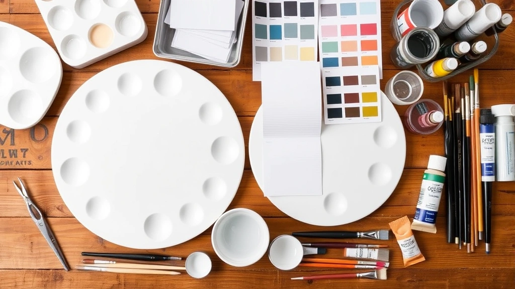
Successful color mixing requires more than just paint. Assemble these essential tools before starting your project:
- Palette: Use ceramic, glass, or plastic palettes designed for mixing. Ceramic offers the best color accuracy since white surfaces show true color values. Avoid porous materials like paper, which absorb pigment unevenly.
- Mixing brushes: Keep dedicated brushes for mixing—never use your application brushes. Flat, stiff brushes work best for thoroughly blending colors.
- Color samples: Collect paint chips or create test swatches on white paper or cardboard to compare against your target shade.
- Measuring tools: Precise ratios matter. Small measuring spoons, syringes, or graduated containers ensure consistency when recreating shades.
- Water or medium: Keep water nearby for acrylics or appropriate mediums for oils and other paints. This adjusts consistency and helps blend thoroughly.
- White and black pigments: Essential for tinting (adding white) and shading (adding black) your base blue.
- Complementary color: A touch of orange helps gray down overly bright blues without using black, which can deadened colors.
- Palette knife: Metal palette knives clean easily and allow better control when working with thick paints.
For household painting projects, you might also consider investing in a color mixing guide for yellow and other primaries, which helps you understand how colors interact in your specific paint brand and finish.
Step-by-Step Color Mixing Process
Now let’s get practical. Follow these steps to create custom blues:
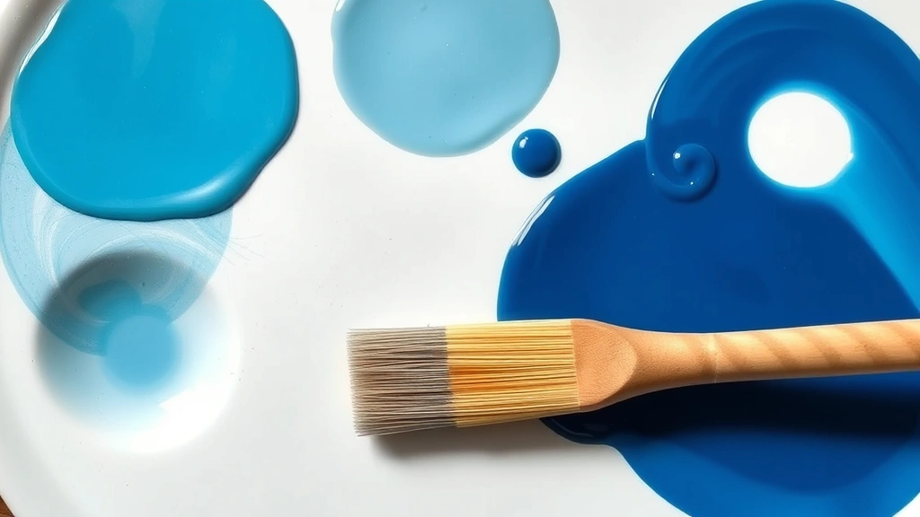
- Start with your base blue: Whether it’s ultramarine, cerulean, or prussian blue, begin with your primary blue pigment. Place a small amount on your palette—you can always add more, but removing excess is difficult.
- Identify your target shade: Have your reference color visible. This might be a paint chip, a photo, or a physical object. Stare at it for several seconds to lock the image in your mind.
- Add modifiers gradually: This is where patience matters. Add white for tints, black for shades, or complementary colors for complex tones. Use just a touch—a tiny amount of modifier dramatically shifts the result.
- Mix thoroughly: Blend your paint completely. Streaks of unmixed color create inconsistent results. Use circular motions with your brush, scraping the palette bottom to incorporate all pigment.
- Test on white paper: Always test your mixed color on white paper or cardboard under your actual lighting conditions. Artificial light and daylight reveal different color values.
- Compare and adjust: Hold your test swatch next to your target. Does it match? If it’s too light, add more blue. Too dark? Add white. Too green? Add a touch of red. Make tiny adjustments and retest.
- Document your recipe: Once you achieve the desired shade, write down exactly what you mixed. Note ratios if possible. This prevents frustration when you need to recreate the color for a second coat or future project.
This methodical approach prevents common frustrations. Many DIYers rush the process, adding too much modifier at once and creating unusable mud. Patience and incremental adjustments yield professional results.
Creating Custom Blue Shades
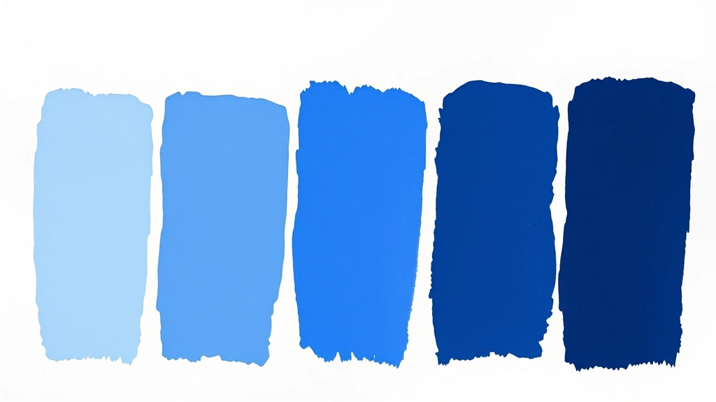
Different blues serve different purposes. Understanding how to create specific shades elevates your DIY game:
Navy Blue: This sophisticated, deep blue works beautifully for accent walls or furniture. Start with your base blue and add a small amount of black—not too much, or it becomes lifeless. Alternatively, add a tiny touch of complementary orange, which creates depth without the deadening effect of pure black. Navy benefits from a satin or semi-gloss finish that enhances its richness.
Sky Blue: Achieve this cheerful, light shade by mixing your base blue with significant amounts of white. The ratio typically ranges from 1 part blue to 4 parts white, though this varies by blue pigment intensity. Test as you go—white pigment can be overpowering.
Teal: This trendy blue-green hybrid starts with your base blue and adds yellow in small increments. The exact ratio depends on whether you prefer a blue-leaning teal or a green-leaning version. Teal works wonderfully in modern bathrooms or as an accent color in eclectic spaces.
Cornflower Blue: This charming, slightly purple-tinted blue requires mixing blue with a tiny amount of red and white. It’s more complex than simple sky blue but offers warmth and character. This shade flatters a wide range of decor styles.
Periwinkle: For this soft, lavender-tinged blue, combine your base blue with white and a modest amount of red or purple. It’s delicate and works well in bedrooms or as a trim color. If you’re interested in exploring purple tones further, check out our guide on how to make purple for additional techniques.
The beauty of custom mixing is that you’re not limited to these examples. Once you understand the principles, you can create infinite variations tailored to your specific project needs and personal preferences.
Common Mistakes and How to Avoid Them
Even experienced DIYers encounter color mixing pitfalls. Learn from these common errors:
Adding too much black: Black is powerful. A single drop often suffices for darkening a quart of paint. Over-reliance on black creates dull, lifeless colors. Instead, layer multiple thin applications of black, or use complementary colors for more sophisticated depth.
Ignoring undertones: Two blues labeled identically might have different undertones. One might lean warm (toward purple), while another leans cool (toward green). Mixing these different blues produces unexpected results. Always test individual pigments before combining them.
Mixing on the wrong palette color: Mixing on a colored palette distorts your perception. Always use white palettes for accurate color assessment. The surrounding color influences how your eyes perceive the mixed shade.
Insufficient blending: Partially mixed paint creates streaky, inconsistent results. Blend until you see no color variations. This takes longer than most DIYers expect, but it’s non-negotiable for professional appearance.
Testing in wrong lighting: Paint color shifts dramatically under different lighting. What looks perfect under fluorescent shop lights might appear completely different in natural daylight or warm incandescent bulbs. Always test your mixed color in the actual space where it will be used.
Not documenting recipes: You’ll forget exact ratios. Jot down your formula immediately after achieving success. Include notes about the specific paint brand and finish, as these affect color perception.
Blue in Different Mediums
Color mixing principles remain consistent across mediums, but application specifics vary:
Acrylic Paint: Acrylics dry quickly, which is convenient but challenging for mixing. Work in small batches and keep your palette misted with water to prevent premature drying. Acrylic paint appears slightly darker when wet and lighter when dry, so always test on scrap material first. For household painting projects, making distilled water provides a pure medium for thinning acrylics without introducing minerals that might affect color.
Oil Paint: Oil paint’s slow drying time allows extended mixing and blending. However, oils require specific solvents and mediums. Turpentine or mineral spirits thin oil paint, and linseed oil adds body. Oil paints maintain their color value whether wet or dry, making them easier for color matching. Always work in well-ventilated spaces when using oil mediums.
Watercolor: Watercolors mix differently because water acts as your medium. Wet your palette, add pigment, and blend with water. Watercolor appears lighter when wet and darker when dry—the opposite of acrylics. This medium excels at transparent layering, allowing you to build complex blue tones through glazing.
Household Wall Paint: Latex and oil-based wall paints follow similar mixing principles to acrylics and oils respectively. Most paint stores offer color-matching services, but understanding DIY mixing gives you flexibility. Wall paint requires thorough stirring after mixing to ensure even pigment distribution throughout the larger volume.
Specialty Mediums: Glazes, stains, and dyes each have unique mixing requirements. Always refer to manufacturer instructions, as some mediums require specific additives or thinning agents. The base mixing principles apply, but execution details matter significantly.
Understanding these medium-specific considerations prevents frustration. What works for acrylic won’t necessarily work for oil, and watercolor techniques differ entirely from household paint applications.
Frequently Asked Questions
Can I make blue without blue pigment?
In traditional pigment mixing, true blue cannot be created without blue pigment—it’s a primary color. However, you can create blue-adjacent colors like cyan (blue-green) by mixing blue with yellow, or blue-purple by mixing blue with red. If you’re working digitally or with light, mixing green and cyan light creates blue. For practical DIY projects, it’s far easier to start with blue pigment and modify it rather than attempt to create blue from other colors alone.
What’s the difference between ultramarine and cerulean blue?
Ultramarine blue is a warm blue with subtle purple undertones, making it ideal for creating navy, periwinkle, and sophisticated cool tones. Cerulean blue is a cool blue with green undertones, perfect for sky blues and teal shades. Starting with the wrong blue for your target shade requires more pigment adjustments, so understanding these differences saves time and materials.
How do I fix a blue that’s too dark?
Add white to lighten it. Start with tiny amounts—white is powerful. Mix thoroughly and test on white paper. If you’re trying to brighten without adding white (which can make colors chalky), you might need to start over with a fresh batch using less blue initially. This is why documenting your recipe matters—you can adjust the ratio for future batches.
Why does my mixed blue look different in different rooms?
Lighting dramatically affects color perception. Warm incandescent bulbs make blues appear warmer and slightly greenish. Cool fluorescent lights enhance blue’s true tone. Natural daylight reveals the most accurate color. Always test your mixed blue in the actual space under its typical lighting conditions before committing to large projects.
Can I mix blue with other colors for creative effects?
Absolutely. Blue mixed with white creates tints. Blue mixed with black creates shades. Blue mixed with complementary orange creates sophisticated grays and muted tones. Blue mixed with adjacent colors on the color wheel (green or purple) creates tertiary colors. Experimenting with these combinations leads to unique, personalized shades unavailable in commercial paint lines. If you’re exploring complementary color relationships, understanding how to make yellow and its interaction with blue provides valuable insight into color harmony.
How much blue pigment do I need for a gallon of paint?
This varies dramatically by pigment intensity and desired shade. For a light tint, you might need just 1-2 ounces of pigment per gallon. For a deep, saturated blue, you might need 8-12 ounces or more. Always start with less and add incrementally. Most paint stores have color-matching machines that calculate exact amounts, but understanding manual mixing gives you flexibility and creative control.
Is there a way to make blue paint less shiny?
Paint sheen (gloss level) depends on the paint formula, not mixing. You cannot reduce sheen by mixing pigments into glossy paint. Instead, purchase paint in your desired sheen level—matte, eggshell, satin, or gloss—and then mix colors within that formula. If you accidentally mixed pigment into high-gloss paint but need matte, you’d need to start over with matte-base paint.
Related Posts

How Long to Boil Lobster Tails: Cooking Guide

How Long to Fly from New York to London? Travel Times
