
How to Make Blue: A Complete Guide
How to Make Blue: A Complete Guide to Color Mixing and DIY Projects
Blue is arguably one of the most versatile and beloved colors in design, art, and home improvement projects. Whether you’re painting a feature wall, mixing custom paint for a furniture restoration, or tackling a creative craft project, knowing how to make blue opens up endless possibilities for your home. The beauty of creating blue isn’t just about the final color—it’s about understanding the science behind color theory and applying it practically to achieve exactly the shade you’re envisioning.
Many people assume blue only comes from a paint can or a pre-mixed bottle, but the reality is far more interesting. You can create stunning blues by mixing primary colors, experimenting with natural dyes, or adjusting store-bought blues to match your specific aesthetic. This guide walks you through every method, from traditional color mixing to modern DIY techniques that’ll make you feel like a professional colorist without the professional price tag.
Let’s dive into the art and science of blue creation, whether you’re working with paints, dyes, or digital mediums. By the end, you’ll have the knowledge to tackle any blue-based project with confidence.
Understanding Primary Colors and Blue
Before you can master how to make blue, you need to understand where blue sits in the color spectrum. In traditional color theory, blue is considered a primary color—meaning it cannot be created by mixing other colors together. However, this applies specifically to the RYB (Red-Yellow-Blue) color model used in traditional art. In the RGB (Red-Green-Blue) model used in digital design, blue is also primary. But here’s where it gets interesting: in the CMY (Cyan-Magenta-Yellow) model used in printing, cyan creates the blue hue.
The distinction matters when you’re working on different projects. If you’re painting walls or furniture, you’re typically working with the RYB model. If you’re designing graphics or working with digital displays, you’re in RGB territory. Understanding this foundational concept helps you make informed decisions about which method to use for your specific project.
Blue naturally appears in nature through various mechanisms—from the sky’s Rayleigh scattering to the pigments in minerals and plants. This natural occurrence inspired humans to extract and create blue pigments for thousands of years, and those same principles apply to modern DIY projects.
Mixing Blue Paint from Scratch
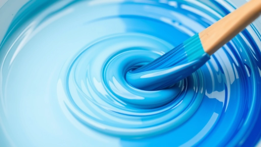
Here’s the practical truth: if you’re working with traditional acrylic or oil paints, you cannot technically create pure blue by mixing other primary colors. However, you can create blue-like hues and various shades of blue by understanding undertones and using the right base colors. If you’re working with gouache or watercolor, you have slightly more flexibility, but you’ll still need a blue base to start.
The most reliable method is to start with a high-quality blue paint as your foundation, then manipulate it to achieve your desired shade. This is where knowing color relationships becomes invaluable. When mixing paint, consider these key principles:
- Undertones matter: A warm blue (containing red undertones) will behave differently than a cool blue (containing green undertones) when mixed with other colors
- Ratio is critical: Start with small amounts of modifying color and gradually add more until you reach your target shade
- Mixing medium affects results: The paint’s medium (acrylic, oil, latex) influences how colors blend and dry
- Pigment quality impacts vibrancy: Professional-grade paints produce more saturated, reliable colors than student-grade options
If you’re interested in exploring complementary color relationships, learning how to make yellow helps you understand how to create green tints by mixing blue with yellow, or how to neutralize overly vibrant blues by adding small amounts of warm tones.
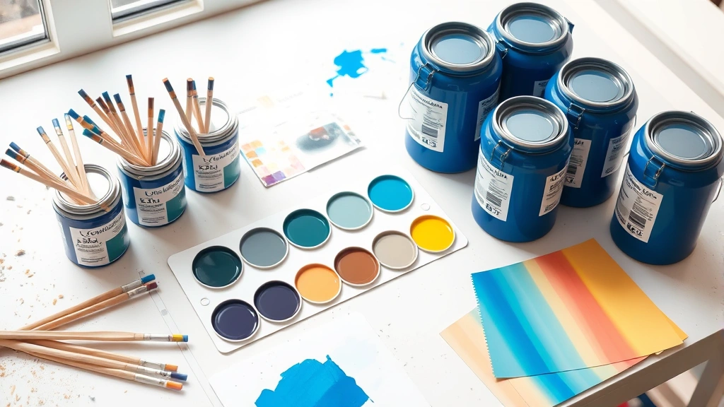
For latex house paint, visit your local paint supplier with color samples or inspiration photos. Most retailers have computerized color-matching systems that can analyze a sample and provide you with an exact formula. This removes much of the guesswork, especially for large projects where color consistency is crucial.
Adjusting and Customizing Blue Shades
Once you have a base blue, the real creative work begins. Adjusting blue to match your vision involves strategic color mixing. Here’s how to achieve specific effects:
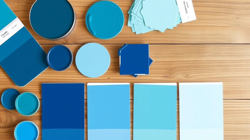
Creating Lighter Blues (Tints): Add white paint to your blue base. Start with a 10:1 ratio of blue to white, then gradually adjust. This creates a pastel or sky-like blue. For very light blues, you might end up with 1 part blue to 3 or 4 parts white. The key is patience—add white incrementally rather than dumping it all in at once.
Creating Darker Blues (Shades): Add black paint or a dark complementary color (like a touch of brown or orange) to deepen your blue. Black can sometimes make blue look muddy, so many artists prefer adding a small amount of its complementary color instead. This creates richer, more sophisticated dark blues. Add these modifiers drop by drop initially.
Creating Blue-Green (Cyan): Mix blue with small amounts of yellow or green. This creates aqua, teal, or turquoise tones depending on the ratio. A 3:1 ratio of blue to green creates a vibrant teal, while adding more yellow shifts it toward cyan.
Creating Blue-Purple (Violet): Mix blue with red or magenta. If you want to explore this direction further, our guide on how to make purple provides deeper insights into achieving the perfect balance between blue and red tones for specific purple shades.
Neutralizing Overly Bright Blues: If your blue feels too vibrant or artificial, add a tiny amount of its complementary color (orange) or a neutral like gray or beige. This creates a more sophisticated, muted tone that works beautifully in interior design.
Keep detailed notes of your mixing ratios. Use a simple notebook or create a digital spreadsheet documenting how much of each color you used. This prevents the frustration of creating a beautiful shade and then being unable to replicate it.
Creating Blue with Natural Dyes
For those interested in sustainable or artisanal approaches, natural blue dyes offer fascinating possibilities. Indigo is the classic natural blue dye, used for centuries to create the deep blues in denim and traditional textiles. While extracting indigo requires some specialized knowledge, the results are stunning and environmentally conscious.
Other natural sources of blue include:
- Woad: A plant that produces a blue dye, historically used before indigo became widely available. It’s easier to work with than indigo for beginners
- Butterfly pea flower: Creates a bright, clear blue dye that’s food-safe and commonly used in teas and natural dyes
- Red cabbage: Technically creates more of a blue-purple, but when combined with alkaline substances, it shifts toward blue
- Blueberries and blackberries: Produce blue and purple tones, though they’re less lightfast than other natural dyes
For home improvement projects like painting or staining, natural dyes work best on natural fibers (cotton, wool, linen) and wood. For painted walls or furniture, you’re better served by conventional paint, as natural dyes typically lack the durability and coverage needed for these applications.
Practical Applications for DIY Projects
Understanding how to make blue becomes truly valuable when you apply it to real projects. Here are common scenarios where custom blue mixing elevates your DIY game:
Accent Wall Painting: Many homeowners want a specific blue that matches their existing décor. Rather than settling for a close-enough option from the paint store, custom mixing ensures perfect coordination. Start with a sample pot of paint and test your mixture on a small section of wall before committing to a full gallon.
Furniture Restoration: Vintage furniture often needs touch-ups or complete repainting. Matching the original blue requires mixing skills. Take a photo of the piece under natural light and bring it to your paint supplier for color matching, or mix small batches yourself until you achieve the right match.
Cabinet Refinishing: Painted cabinets are hugely popular in modern kitchens and bathrooms. Creating custom cabinet colors through mixing allows you to achieve designer-quality results on a DIY budget. Use high-quality cabinet paint and primer for best results.
Craft Projects: From painting decorative items to creating custom artwork, knowing how to adjust blue tones gives you professional-level control. Whether you’re working with acrylics on canvas or painting terra cotta pots, these mixing principles apply universally.
Staining and Wood Finishes: Blue wood stains can be created by mixing liquid wood dyes or by applying blue paint over stain. This technique works beautifully for creating ombré effects on wooden shelving or accent pieces. For detailed guidance on water-based solutions, our article on how to make distilled water explains how to prepare water for diluting dyes and finishes properly.
Before starting any large project, always test your custom blue on a hidden area or a sample board. Paint dries differently than wet paint appears, and lighting significantly affects how colors look. This simple step prevents expensive mistakes.
Common Mistakes and How to Avoid Them
Mistake #1: Adding Too Much White at Once When lightening blue, it’s easy to overshoot and end up with a washed-out color. Solution: Add white in very small increments—literally a few drops at a time. It’s easier to add more white than to darken a shade that’s become too pale.
Mistake #2: Using Black to Darken Instead of Complementary Colors Black can make blue look muddy or greenish. Solution: Use dark brown, navy, or a touch of orange instead. These create richer, more sophisticated dark blues.
Mistake #3: Not Accounting for Drying Time Wet paint looks different from dry paint. Blues especially can appear more saturated when wet. Solution: Wait at least 24 hours before deciding if your color is correct. Apply samples to the actual surface you’re painting to see how it looks in that specific lighting.
Mistake #4: Ignoring Lighting Conditions The same blue looks completely different under natural light, LED bulbs, and incandescent bulbs. Solution: Test your color under the actual lighting conditions where it will be used. Paint a large sample board and observe it at different times of day.
Mistake #5: Forgetting to Document Ratios Creating a beautiful color and then losing the formula is heartbreaking. Solution: Photograph your color samples with notes about the exact ratios used. Use your phone’s notes app or a simple notebook.
Mistake #6: Using Low-Quality Paint Base Starting with cheap paint makes achieving vibrant, true blues difficult. Solution: Invest in mid-range or professional-grade paint. The color payoff and durability justify the extra cost, especially for visible projects.
For additional technical guidance on paint application and preparation, This Old House’s painting guide provides excellent step-by-step instructions. Additionally, Family Handyman’s room painting tutorial covers surface preparation, which directly impacts how your custom blue color appears.
Frequently Asked Questions
Can I make blue from red and yellow?
In the traditional RYB color model, no—blue is a primary color and cannot be created by mixing red and yellow. However, mixing red and yellow creates orange, and understanding color relationships helps you modify existing blues. If you’re working with digital RGB colors, you can create blue by combining red and green light, but this doesn’t apply to physical paint mixing.
What’s the best paint for mixing custom colors?
Acrylic paint is ideal for beginners because it’s easy to clean up, dries quickly, and allows you to test colors rapidly. For furniture and walls, latex (water-based) house paint offers excellent coverage and durability. Oil paint provides the richest colors but requires solvents and longer drying times. For your specific project, consider the surface you’re painting and your comfort level with different mediums.
How do I make a navy blue?
Start with a medium or bright blue and add small amounts of black or dark brown. A typical ratio is 10 parts blue to 1 part black or brown, but adjust based on how dark you want the navy. Navy should be deep and sophisticated, not muddy. Test on a sample surface before committing to a full batch.
Will my custom blue color match if I make it again?
Matching custom colors is challenging without precise documentation. This is why professional painters use color-matching technology and paint stores can remix exact formulas. If you’re creating a large project, buy extra paint mixed at the same time rather than attempting to remix later. If you must remix, photograph your original color under natural light and bring the photo to your paint supplier for computer color matching.
Can I use food coloring to make blue paint?
Food coloring can tint water-based mediums like watercolor or acrylic paint, but it’s not ideal for wall paint or furniture. Food coloring fades quickly when exposed to sunlight and doesn’t provide the durability needed for practical applications. For craft projects and artistic work, it’s acceptable, but for home improvement projects, invest in proper paint pigments.
What’s the difference between teal and turquoise?
Both are blue-green colors, but turquoise leans more toward blue with just a touch of green, while teal contains more green and appears deeper. Turquoise is brighter and more vibrant, often appearing more blue-dominant. To create turquoise, start with bright blue and add a small amount of green (roughly 5:1 ratio). For teal, use more green relative to your blue (closer to 3:1 or 2:1).
Is there a color that makes blue look more blue?
Yes—colors opposite blue on the color wheel (orange and warm yellows) make blue appear more vibrant and intense by contrast. This is why blue and orange are a popular color pairing in interior design. Additionally, surrounding blue with neutral colors like white, gray, or beige allows the blue to stand out without competing for attention.
Related Posts

How Long to Boil Lobster Tails: Cooking Guide

How Long to Fly from New York to London? Travel Times
