
How to Make Yellow: A Color Mixing Guide
How to Make Yellow: A Comprehensive Color Mixing Guide
Yellow is one of those colors that seems simple until you actually try to create it from scratch. Whether you’re painting a accent wall, mixing custom paints for a home renovation project, or exploring artistic endeavors, understanding how to make yellow opens up a world of creative possibilities. The truth is, yellow mixing isn’t just about combining two colors and hoping for the best—it’s about understanding color theory, knowing your materials, and having the confidence to experiment.
This guide walks you through everything you need to know about creating yellow, from the fundamental color theory principles to practical applications in your home improvement projects. We’ll explore different methods, troubleshoot common mistakes, and give you the knowledge to mix yellows that match your exact vision. Whether you’re working with paints, dyes, or digital tools, the principles remain surprisingly consistent.
Understanding Color Theory and Primary Colors
Before we dive into the mechanics of making yellow, let’s talk about what yellow actually is in the context of color theory. In traditional art education, we learn about primary, secondary, and tertiary colors. However, this gets complicated because there are actually two main color models: the RYB (Red-Yellow-Blue) model taught in most schools, and the RGB (Red-Green-Blue) model used in light and digital displays.
In the traditional RYB model, yellow is considered a primary color, meaning it cannot be created by mixing other colors. It’s a fundamental building block. However, in the RGB model used by screens and light-based applications, yellow is actually created by combining red and green light. This distinction matters enormously depending on what you’re working with.
The confusion often stems from the fact that different color systems work differently. When you’re dealing with reflected light (like paint on a wall), you’re working with one set of rules. When you’re dealing with transmitted light (like on a computer screen), you’re working with another set entirely. Understanding which system applies to your project is the first step toward success.
Color theory also teaches us about color temperature—whether a color leans warm or cool. Yellow itself is generally considered a warm color, but even yellows can be warmer (leaning toward orange) or cooler (leaning toward green). This nuance becomes important when you’re trying to match specific shades or create harmonious color schemes throughout your home.
The Basic Method: Red and Green
If you’re working with light-based applications or digital design, the answer to how to make yellow is straightforward: combine red and green light in equal proportions. This is the additive color model, where light wavelengths combine to create new colors. On your computer screen right now, the yellow you’re seeing (if any) is actually created this way—red and green pixels working together to fool your eye.
In HTML and web design, yellow is represented by the hex code #FFFF00, which translates to maximum red (FF), maximum green (FF), and no blue (00). If you’re working with RGB values, that’s 255, 255, 0. This is pure, digital yellow—the brightest, most saturated version possible on a screen.
However, this method doesn’t work the same way with physical paints and pigments. If you literally mix red and green paint together, you won’t get yellow—you’ll get a muddy brown or grayish color. This is because paint works with the subtractive color model, where pigments absorb light rather than emit it. The rules are fundamentally different.
Understanding this distinction is crucial for DIY projects. If you’re painting your home, you need to know you’re working in a subtractive system. If you’re designing mockups digitally before you start your project, you’re working in an additive system. The colors you see on your screen won’t perfectly match the paint on your wall—and that’s completely normal and expected.
Working with Paint: Oils, Acrylics, and Watercolors
When it comes to physical paints, the traditional approach to making yellow depends on your specific medium. Let’s break down each type, because they each have their own quirks and best practices.
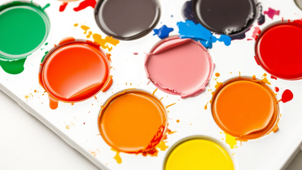
Acrylic Paint
Acrylic paint is probably the most forgiving medium for color mixing, making it ideal for home improvement projects and DIY wall treatments. If you want to create yellow with acrylics and you don’t have pure yellow on hand, your best bet is to start with a warm red (one that leans slightly orange) and add a small amount of white. This won’t give you a true secondary yellow, but it creates a pale, creamy yellow that works beautifully for certain applications.
Better yet, most acrylic paint sets include yellow as a primary color, so you rarely need to mix it from scratch. However, if you need to create specific yellow tones—like a mustard yellow or a pale butter yellow—mixing becomes essential. Start with your base yellow and gradually add other colors. A tiny bit of orange makes it warmer; a touch of green makes it cooler and more muted.
Oil Paint
Oil painting requires more patience and precision than acrylics, but the principles are similar. Yellow is typically a primary color in oil paint sets, but if you’re working with a limited palette, you can approximate it by mixing a warm red with a small amount of white and a hint of orange. The key with oils is to work slowly—add your modifying colors in tiny increments because oils don’t dry quickly, and you can easily overmix and create mud.
One advantage of oils is their richness and depth. Even mixed yellows in oils tend to have more character than their acrylic counterparts. This makes them excellent for detailed home art projects, though they’re less practical for large wall applications due to drying times and ventilation requirements.
Watercolor
Watercolor presents unique challenges because you’re working with transparency and water as your primary medium. Most watercolor sets include yellow as a primary, but if you’re mixing, you’ll find that watercolors behave differently than acrylics or oils. The pigment concentration matters enormously, and water dilution can dramatically change your results.
To create yellow variations in watercolor, you’ll often rely more on dilution and layering than on mixing. A concentrated yellow mixed with a touch of red and then diluted with water creates entirely different results than the same mixture used at full strength. This unpredictability is part of watercolor’s charm, though it requires more experimentation.
Digital and Design Applications
If you’re planning your home improvement project digitally first—which is honestly a smart move—you’ll be working with RGB or HSL color models. Understanding how to specify yellow in digital applications helps you communicate your vision to contractors, match colors across different materials, and preview your project before committing to paint.
In RGB, pure yellow is 255, 255, 0 as mentioned earlier. But digital yellows can range from nearly white (255, 255, 200) to deep gold (200, 150, 0). Each adjustment changes the saturation and brightness, giving you infinite yellow options to explore.
HSL (Hue, Saturation, Lightness) is often more intuitive for designers. In this model, yellow sits at 60 degrees on the color wheel. You can create lighter yellows by increasing lightness, more muted yellows by decreasing saturation, and warmer or cooler yellows by adjusting the hue value slightly (toward orange or green respectively).
When you’re using design software to preview paint colors, remember that your monitor’s color accuracy matters. Professional designers calibrate their screens specifically because uncalibrated monitors can display colors inaccurately. If you’re serious about matching digital designs to physical paint, bring your phone or tablet to the paint store and compare your digital yellow to actual paint samples under the store’s lighting.
Common Mistakes and How to Fix Them
Even experienced DIYers make mistakes when mixing colors. Here are the most common pitfalls and how to avoid or recover from them.
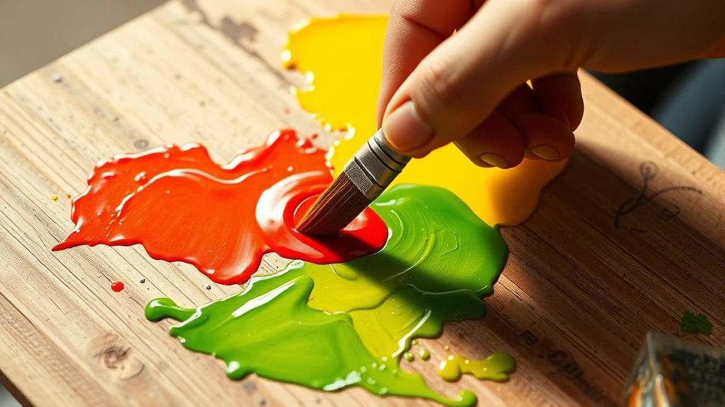
Mistake #1: Muddy or Brownish Yellow
This is the classic error when mixing paint. You end up with something that looks more brown than yellow. This usually happens because you’ve added too much red, or you’ve mixed complementary colors (yellow and blue) which neutralize each other and create brown. If this happens, don’t panic. Add more of your base color—whether that’s white, or actual yellow if you have it—to dilute the muddy tone. You may not achieve perfect yellow, but you can salvage it into a workable shade.
Mistake #2: Yellow That’s Too Pale or Washed Out
If you’ve added too much white trying to create a light yellow, you’ve essentially created off-white. Light yellow requires a delicate balance. Start with a true yellow and add white gradually. Usually, you need far less white than you think. If you’ve already gone too pale, add a tiny bit of pure yellow back into the mix.
Mistake #3: Color Shifting Over Time
Some yellows, particularly those made with certain pigments, can shift or fade over time, especially when exposed to sunlight. This is particularly important for exterior home projects. When selecting paint, look for high-quality formulations with UV-resistant pigments. Check the paint’s specifications—better paints explicitly state their fade resistance.
Mistake #4: Inconsistent Batches
If you’re mixing your own yellow paint for a large project, consistency is crucial. Mix all your paint at once rather than making multiple batches. Lighting conditions, pigment settling, and slight variations in mixing can create noticeable differences between batches. If you run out, take a sample of your mixed paint to a paint store—many can scan and match custom colors.
Creating Yellow Variations and Tones
Pure yellow is just the starting point. Understanding how to create variations gives you the flexibility to match any design vision.
Warm Yellows (Golden, Honey, Mustard)
To push yellow toward the warm side, add tiny amounts of red or orange. A mustard yellow—that trendy, sophisticated shade—requires adding a touch of red and a hint of gray or brown. These warm yellows work beautifully in traditional or eclectic home designs. They’re less bright than pure yellow, making them more livable for large wall applications.
Cool Yellows (Lemon, Pale, Greenish)
Add a tiny bit of green or blue to create cooler yellows. Lemon yellow, with its bright, slightly acidic tone, comes from adding just a whisper of green to pure yellow. These cooler yellows feel fresh and modern, perfect for contemporary kitchens or bathrooms. They’re also excellent for small spaces because they feel less heavy than warm yellows.
Muted and Sophisticated Yellows
Add gray or a touch of the yellow’s complementary color (purple or blue) to create muted versions. These sophisticated yellows are perfect for those who love the color but want something more subtle. They work in virtually any room because they’re less demanding than bright yellows.
When creating variations, remember that lighting dramatically affects how colors appear. A yellow that looks perfect under warm incandescent bulbs might look entirely different under cool LED or natural daylight. Always test your mixed colors in the actual space with the actual lighting you’ll be using.
Practical Home Improvement Applications
Now that you understand how to make yellow, let’s talk about actually using it in your home. Yellow is a versatile color that can work in almost any room, but application matters.
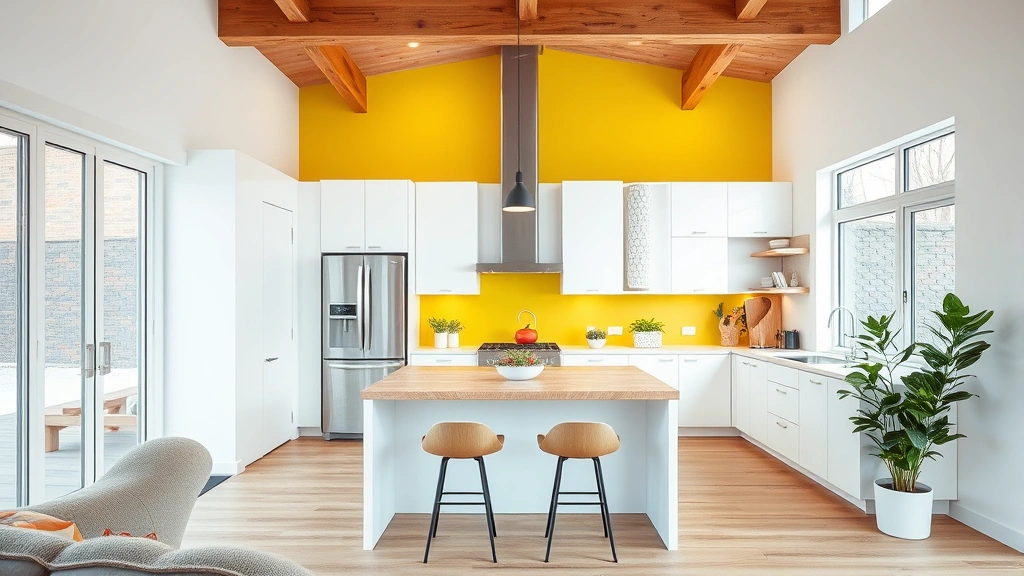
Kitchen Applications
Kitchens are natural homes for yellow. It’s warm, energizing, and complements both traditional and modern aesthetics. If you’re painting your kitchen, consider a warm, golden yellow for the walls and pair it with white or cream trim. This combination creates a cheerful, inviting space without overwhelming the senses. For cabinet painting, you might want a slightly more muted yellow—it ages better and hides imperfections more gracefully than bright yellow.
Bedroom Considerations
While yellow might seem too energizing for a bedroom, pale or cool yellows can actually create a calming, restful environment. Think pale butter yellow or soft lemon. These work beautifully as accent walls or in combination with other soft colors. Avoid bright, saturated yellows in bedrooms—they can interfere with sleep and relaxation.
Bathroom and Spa Spaces
Yellow works wonderfully in bathrooms, particularly in combination with natural materials like wood and stone. A pale yellow creates a spa-like atmosphere, while a richer golden yellow feels luxurious and warm. This is also an excellent place to experiment with textured finishes—a matte finish yellow feels more sophisticated than a glossy one.
Accent Walls and Trim
If you’re nervous about committing to yellow everywhere, try an accent wall. A single wall in a warm, golden yellow can transform a space. Alternatively, paint your trim in a pale yellow while keeping walls neutral—this creates visual interest without the commitment of full-wall color. This approach is particularly effective in living rooms and home offices.
Exterior Applications
Yellow exterior paint requires confidence, but it can look absolutely stunning on the right house. Pale or warm yellows work better than bright yellows for exteriors—they’re more timeless and less likely to look dated in a few years. Make absolutely certain your paint has excellent UV protection and fade resistance if you’re painting outside.
When mixing paint for exterior applications, consider the undertones carefully. Your house will be visible in various lighting conditions—morning sun, afternoon shadow, artificial light at night. Test your mixed yellow in all these conditions before committing to painting the entire exterior.
Frequently Asked Questions
Can I make yellow from primary colors other than red and green?
In the traditional RYB model, yellow is considered primary and cannot be made from other colors. However, in RGB (light-based) systems, yellow is always red plus green. In CMY printing, yellow is a primary color. The answer depends entirely on your color system.
Why does my mixed yellow look muddy or brown?
The most common cause is adding too much red or accidentally mixing in blue (which creates green when combined with yellow, then brown). Start with less of each color and add gradually. If you’ve already created mud, dilute it with white or add more of your base color.
How do I make yellow paint lighter without adding white?
You can dilute paint with a clear medium or glaze, though this reduces opacity. For most applications, white is the best option. However, adding too much white can make yellow look washed out—add it gradually and in small amounts.
What’s the difference between cadmium yellow and other yellow pigments?
Different pigments create different qualities of yellow. Cadmium yellow is warm and rich but can be expensive. Hue yellows are more affordable alternatives. For home projects, quality acrylic or latex paint in the yellow you want is usually more practical than worrying about specific pigments.
Can I match my digital design yellow to physical paint?
Not perfectly, but you can get close. Monitor calibration matters, and lighting affects perception significantly. Bring your digital reference to the paint store and compare it to actual paint samples under the store’s lighting. Order a quart and test it in your actual space before committing to gallons.
How do I prevent yellow paint from fading?
Use high-quality paint with UV-resistant pigments, particularly for exterior applications. Interior yellows fade less unless the room gets intense direct sunlight. Close curtains during peak sun hours if fade is a concern, and consider using matte finishes which hide fading better than glossy ones.
What’s the best yellow for small spaces?
Cooler, paler yellows (like pale lemon or butter) work best in small spaces. They feel less heavy and overwhelming than warm, saturated yellows. If you love bold yellow, use it as an accent wall rather than painting the entire room.
Can I mix different types of paint together?
Generally, no. Don’t mix acrylics with oils, or latex with oil-based paints. They have different binders and won’t combine properly. However, you can mix different brands of the same type (like two different acrylic paints), though quality can vary.
Related Posts

How Long to Boil Lobster Tails: Cooking Guide

How Long to Fly from New York to London? Travel Times
